
Barnes & Noble Rebrand Concept - A modern chapter for a literary classic
Strategic storytelling through modern identity
This rebrand concept repositions Barnes & Noble for a new generation while honoring its literary legacy. By blending playful design with purposeful strategy, the refreshed identity invites deeper engagement, stronger brand recognition, and a more immersive in-store experience. It’s a brand built to evolve—just like the stories it shares.
Project Overview
A joyful reinvention of a beloved institution
The goal was clear: breathe new life into a brand rooted in literary tradition. Barnes & Noble has always been more than a bookstore—it's a place of discovery, nostalgia, and connection. The rebrand embraces this spirit, while injecting a burst of fresh energy that aligns with today’s visual and cultural landscape.
Vibrant palettes, bright open layouts, and welcoming details invite visitors to step inside and stay awhile. The new identity is joyful, clean, and intentional—designed to reflect the magic of reading in every form.
The Challenge
Honoring the past while designing for the future
Barnes & Noble’s original branding carried weight—but also a sense of stagnation. The challenge was to evolve without erasing. I aimed to bridge the gap between generations: appealing to loyal patrons while connecting with a younger, design-aware audience.
This meant updating tone, texture, and typography—without losing the warmth that made the brand beloved in the first place.
Concept & Direction
A celebration of diversity in storytelling
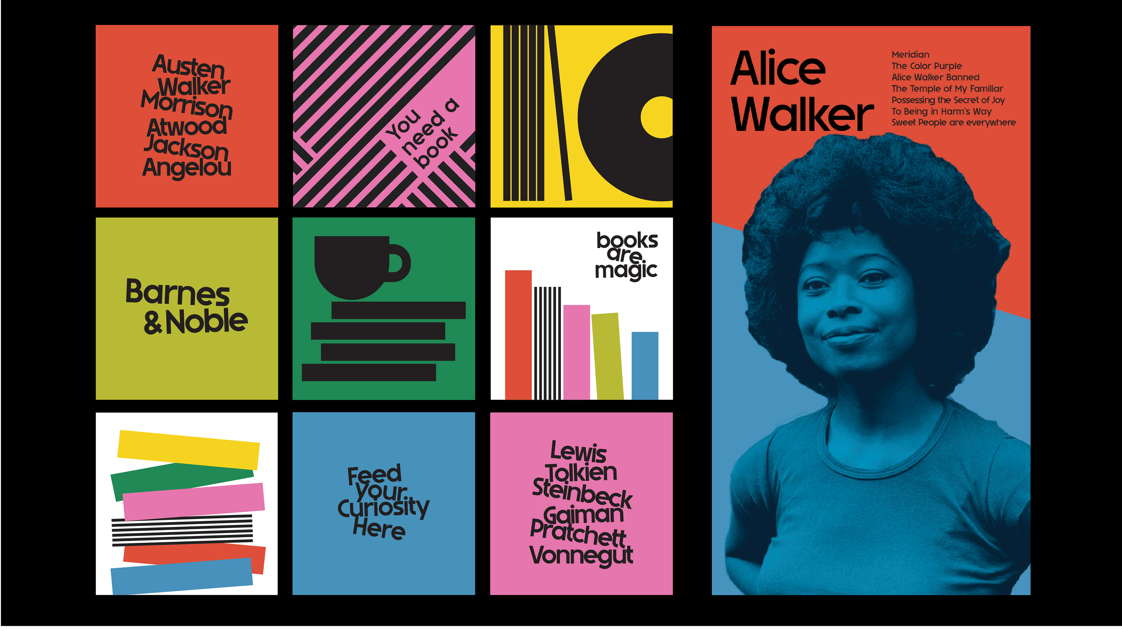
Inspired by the richness and range of literature, the rebrand celebrates the stories that shape us. The visual language leans into bold geometry, clean layouts, and a sense of movement—like flipping through pages or wandering the aisles of your favorite bookshop.
Typography plays a starring role, with custom letterforms that subtly echo the physicality of books—stacked, leaning, nestled. The graphic system is vibrant yet minimal, giving the content space to breathe while keeping the brand playful and fresh.
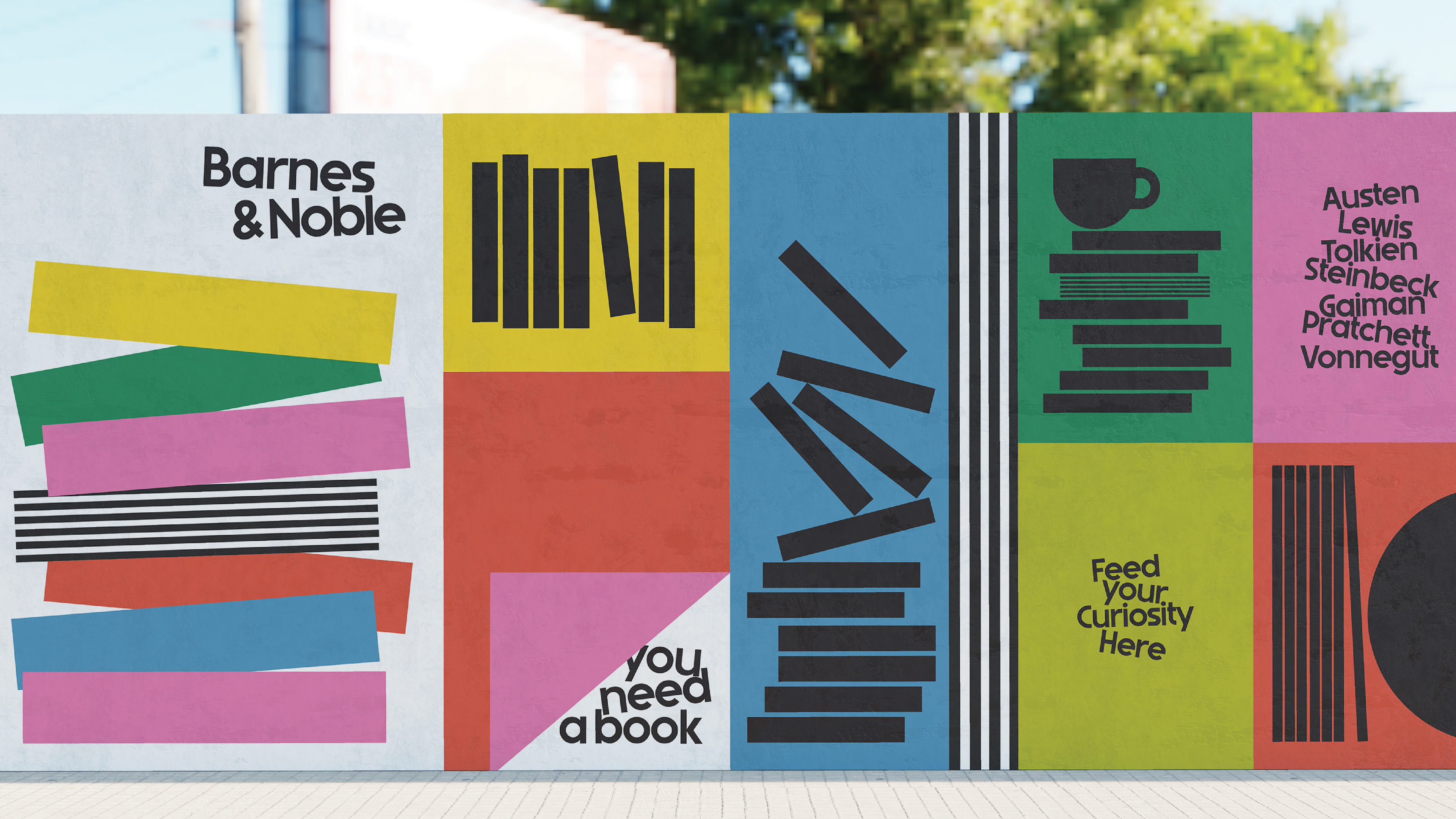
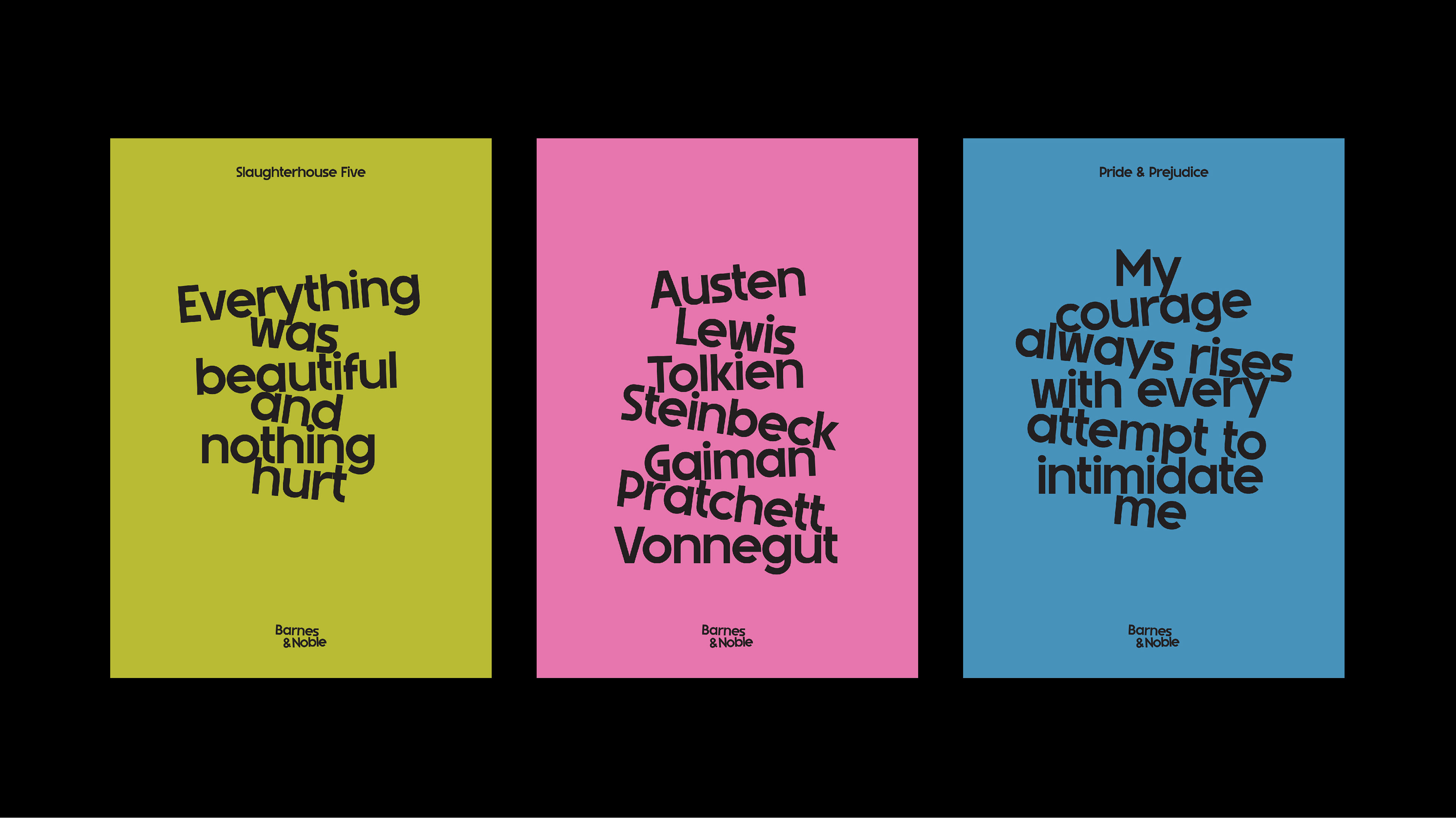
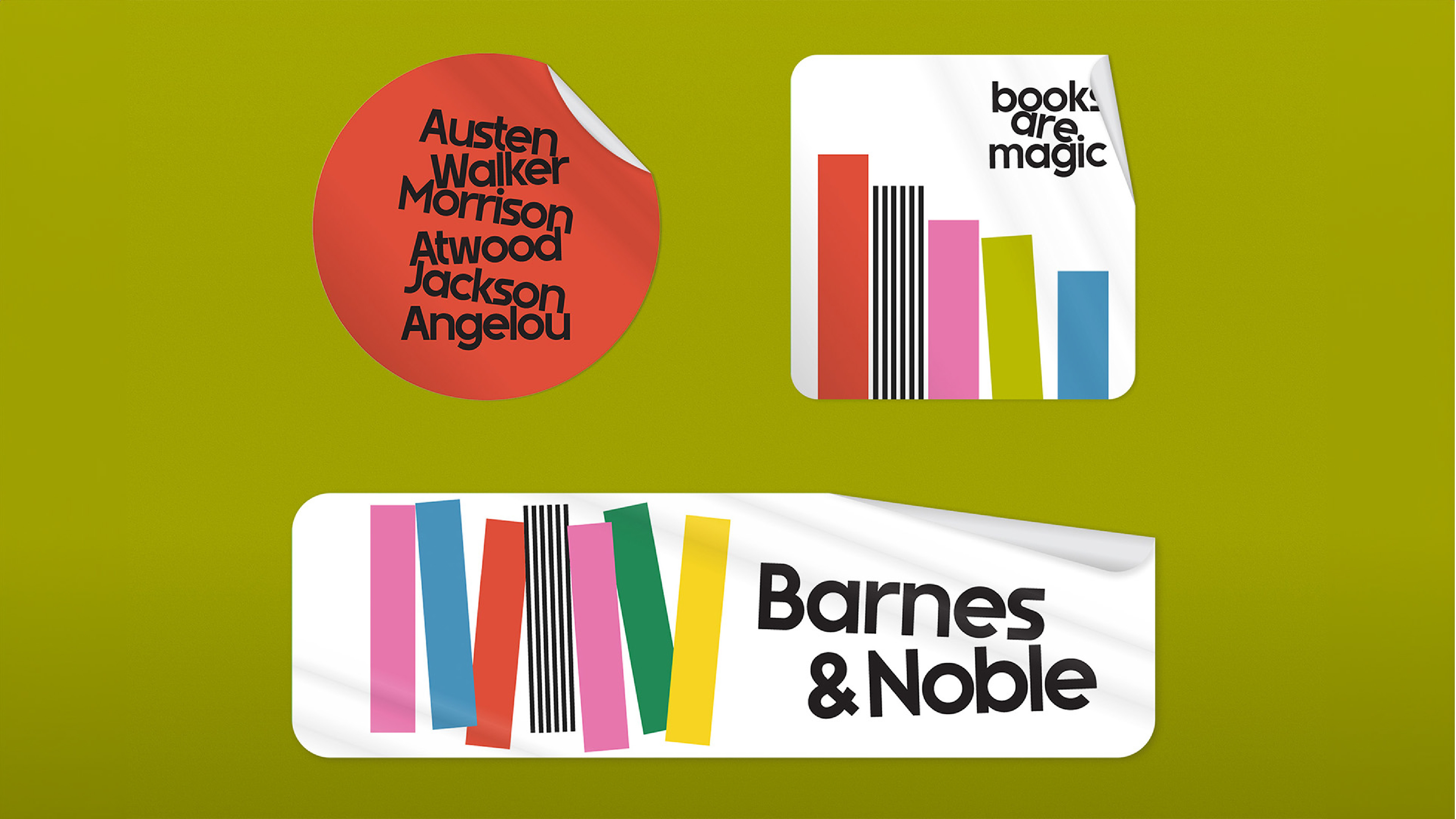
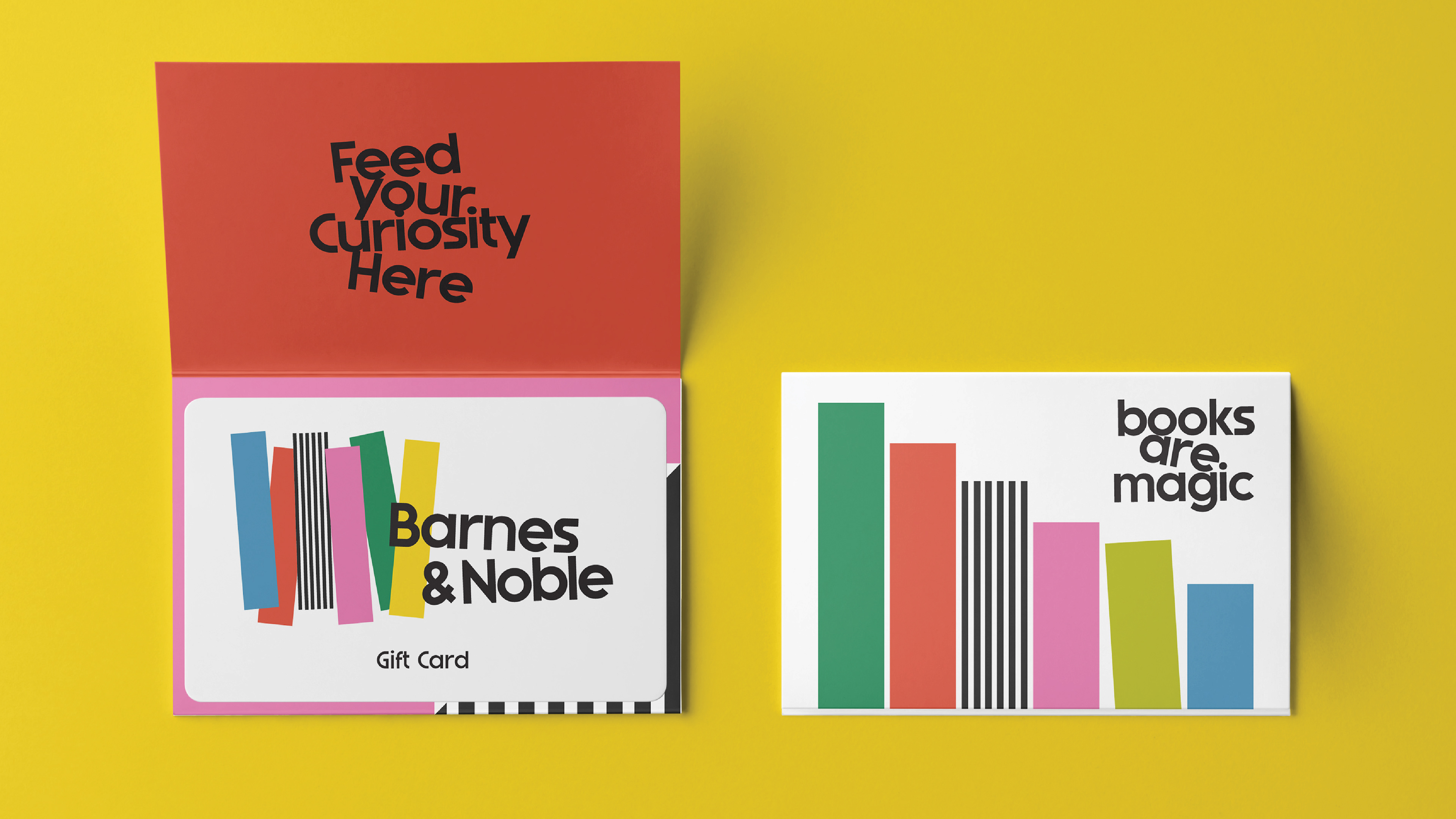
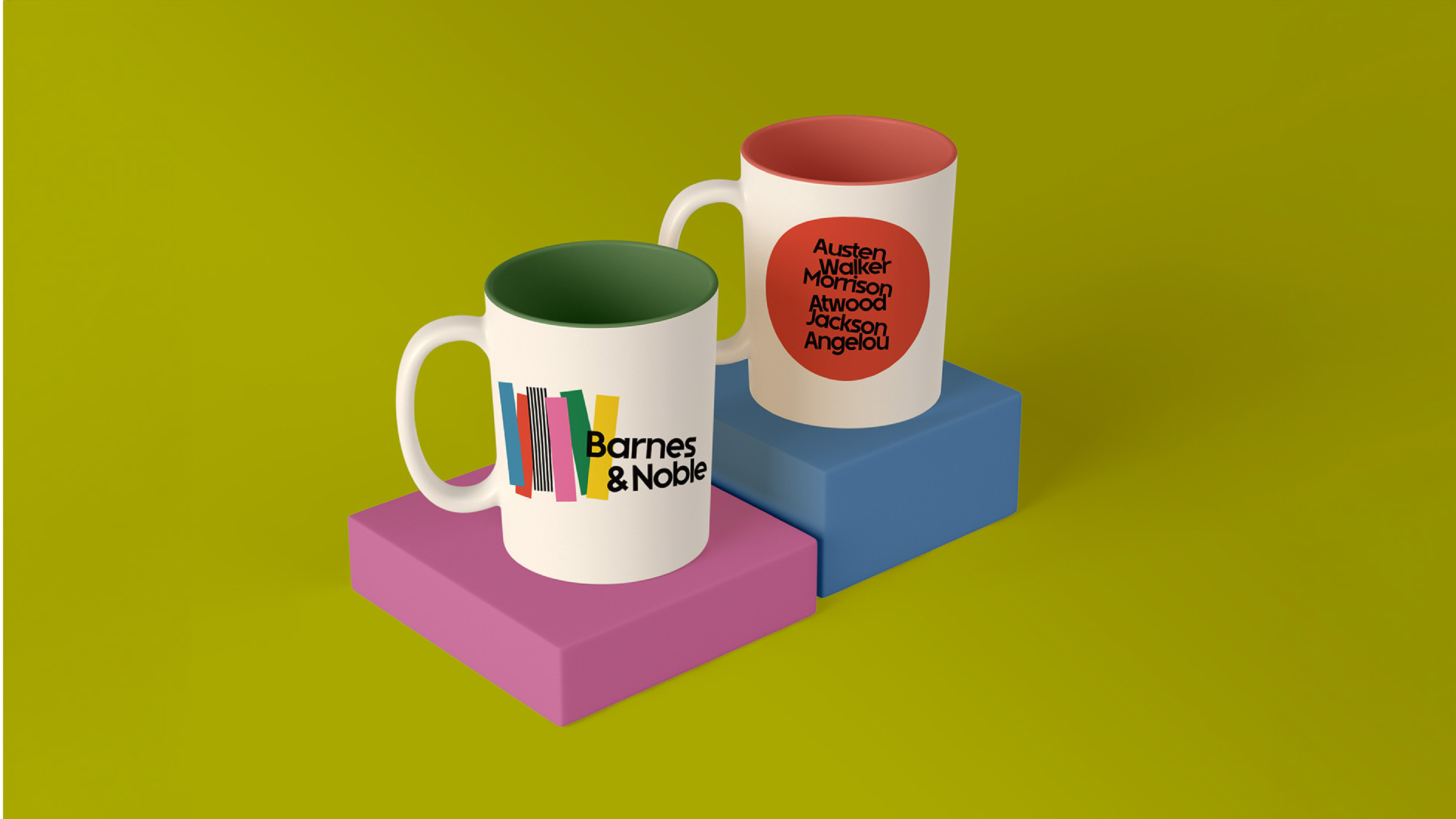
Logo Development
A wordmark that stacks up
At the heart of the rebrand is a custom wordmark that captures the spirit of Barnes & Noble’s evolution. Inspired by the physicality of books themselves, the logo features letterforms that tilt and stack—playfully nodding to books on a shelf or mid-read.
This subtle motion brings warmth and personality to the brand, instantly making it feel more friendly, creative, and accessible. The logo feels dynamic, yet grounded—just like the stories it represents.
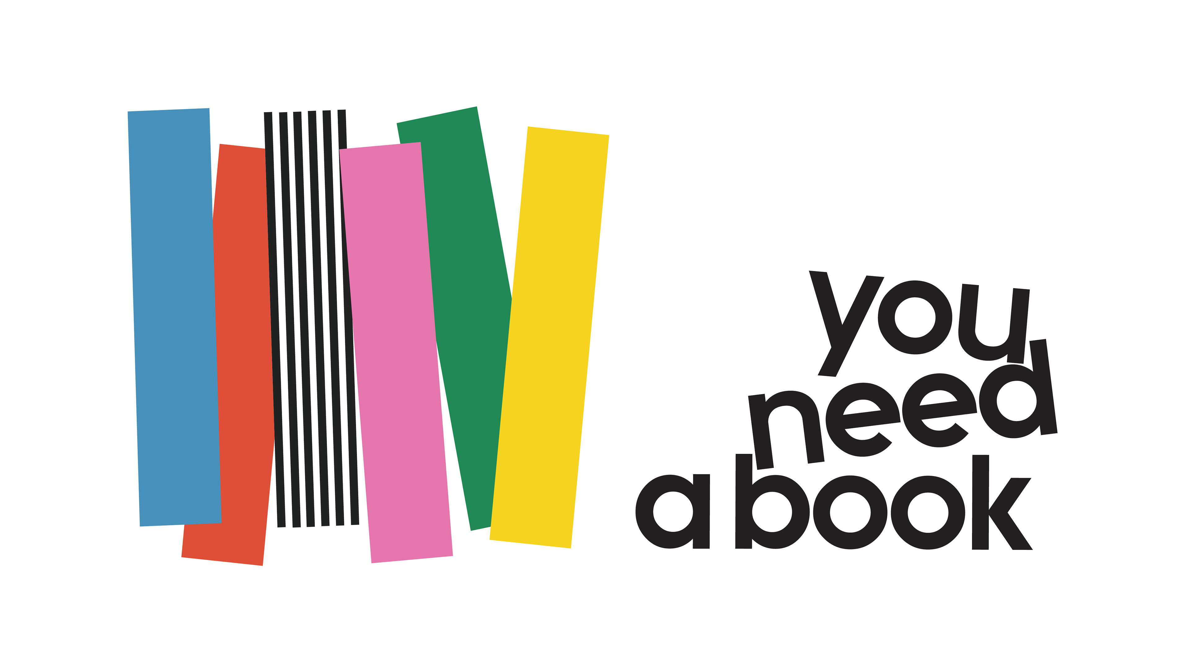
The idea of stacking extends beyond the logo. Throughout the brand system, you’ll see this motif reappear in posters, merchandise, and signage—creating a visual thread that ties everything together while reinforcing the joy and movement of reading.
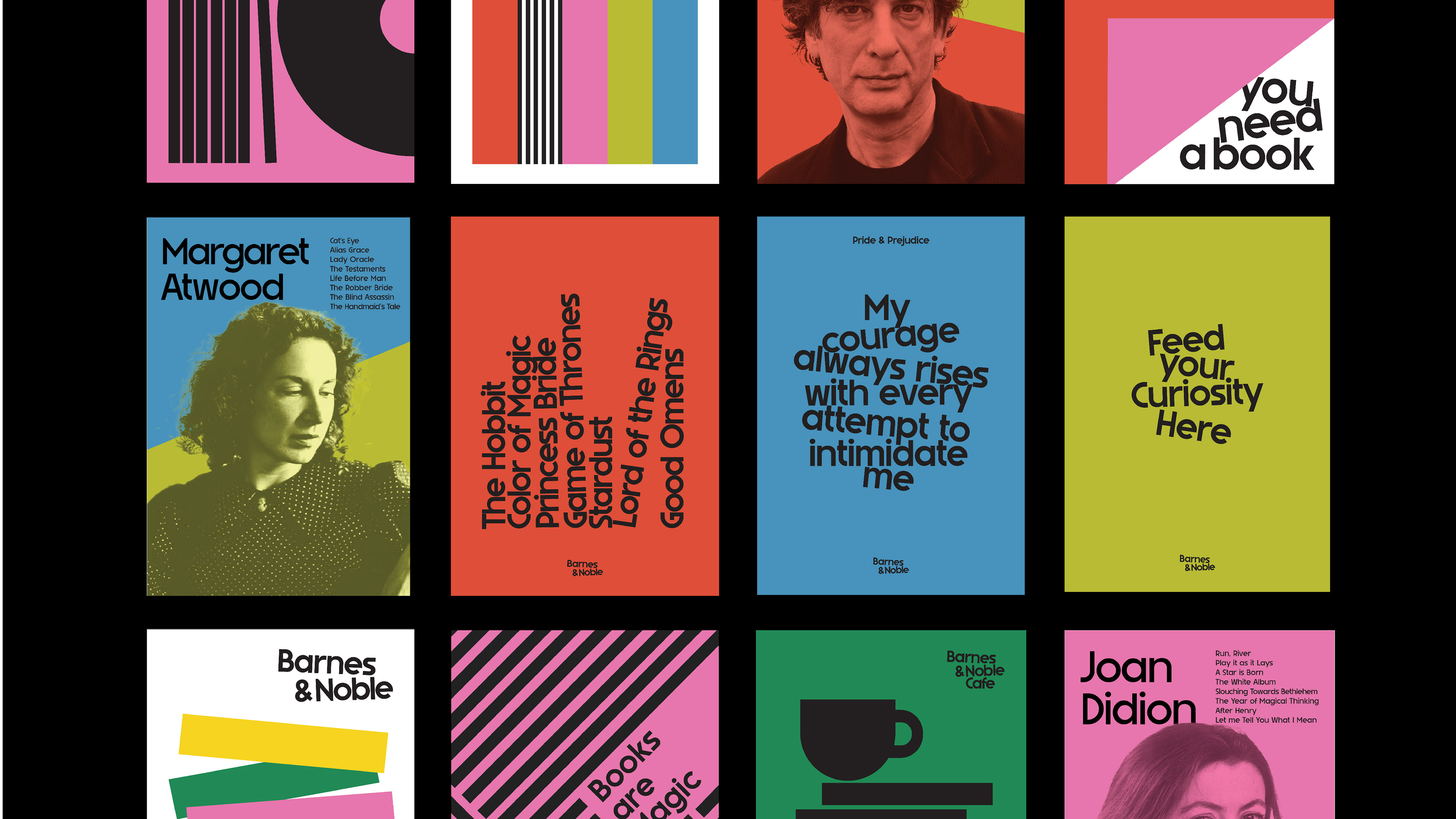
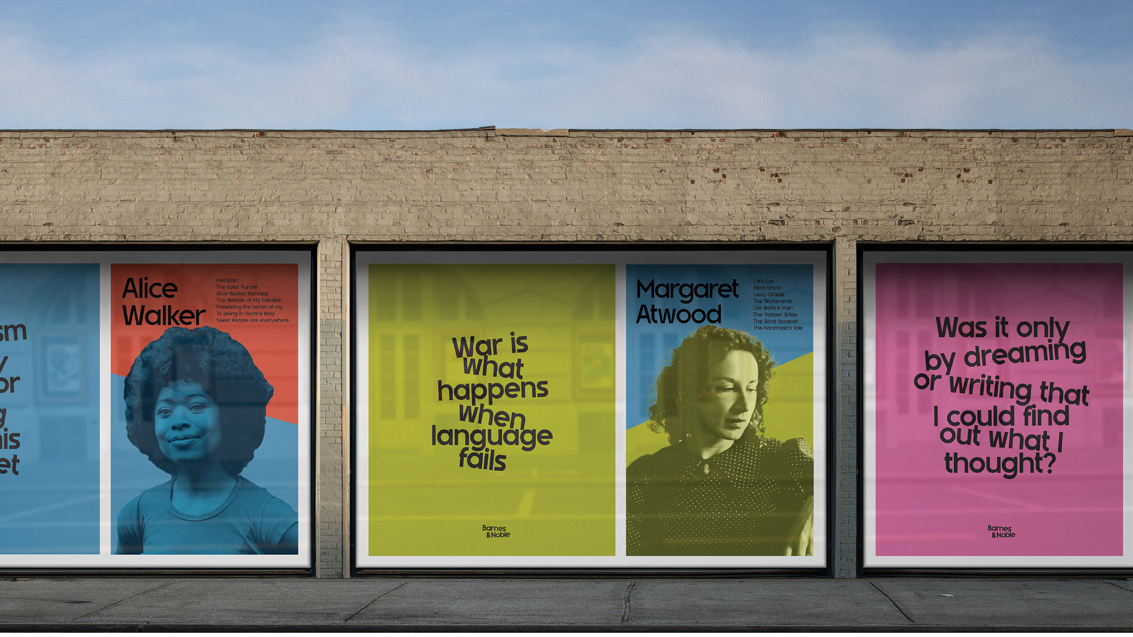
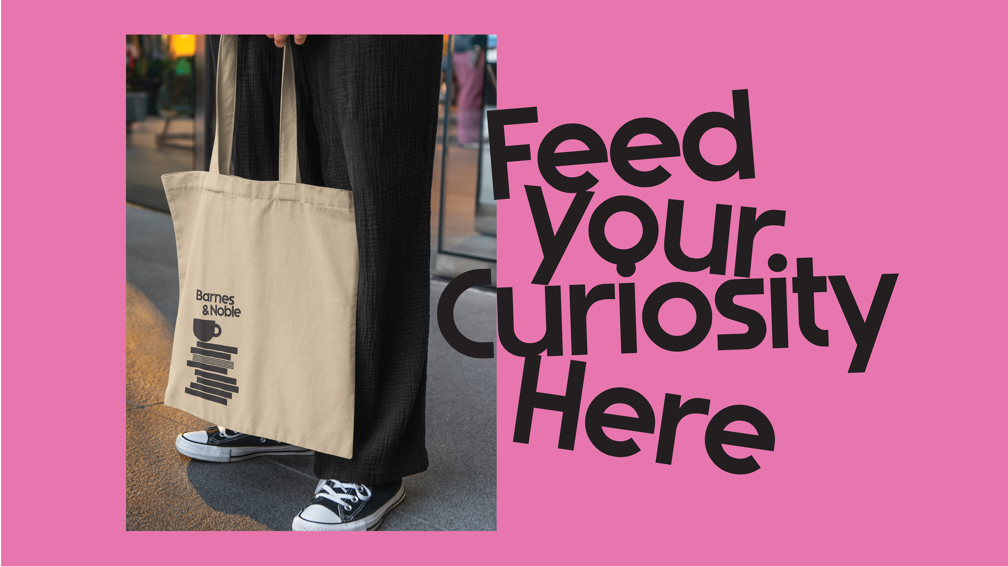
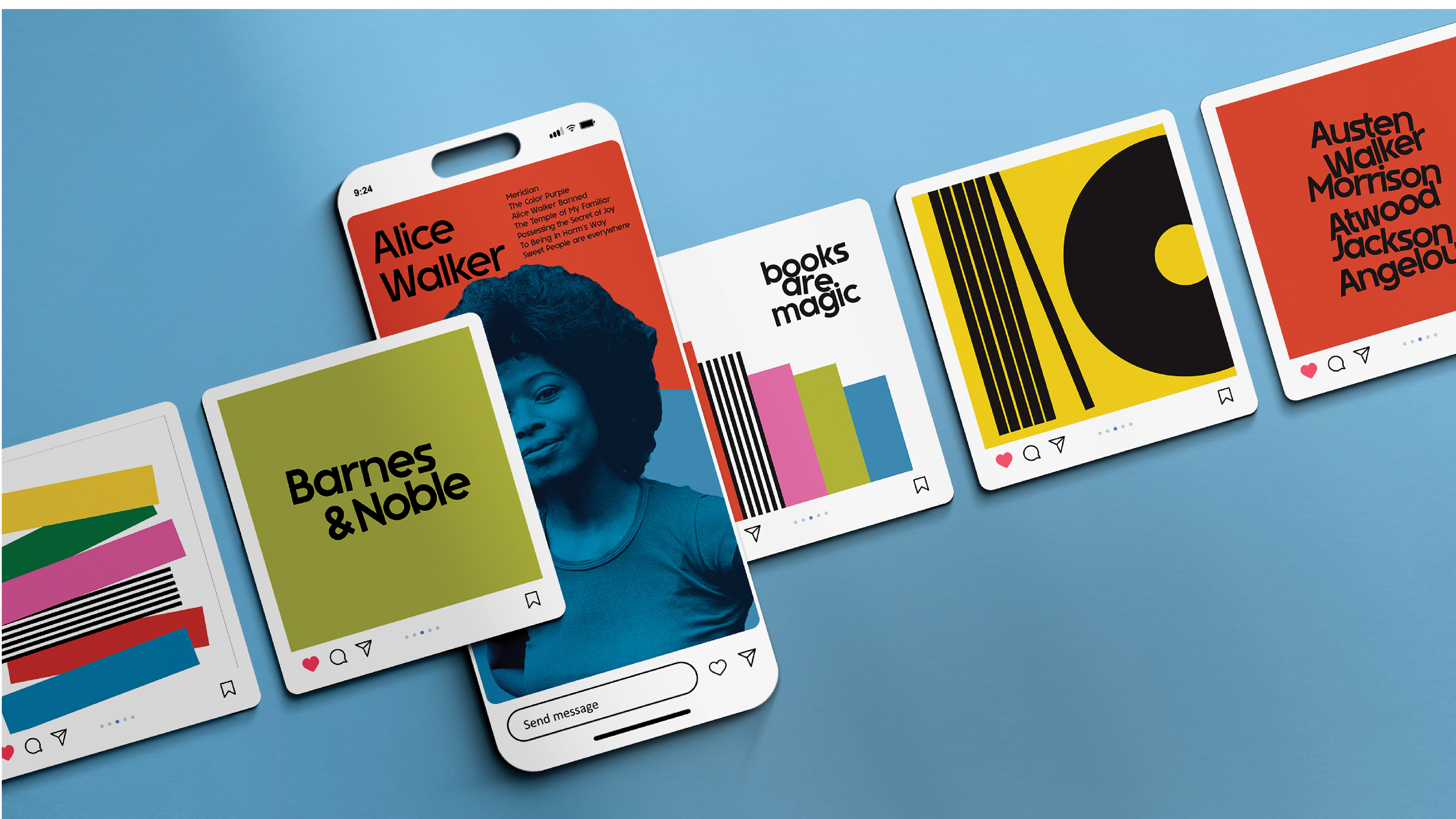
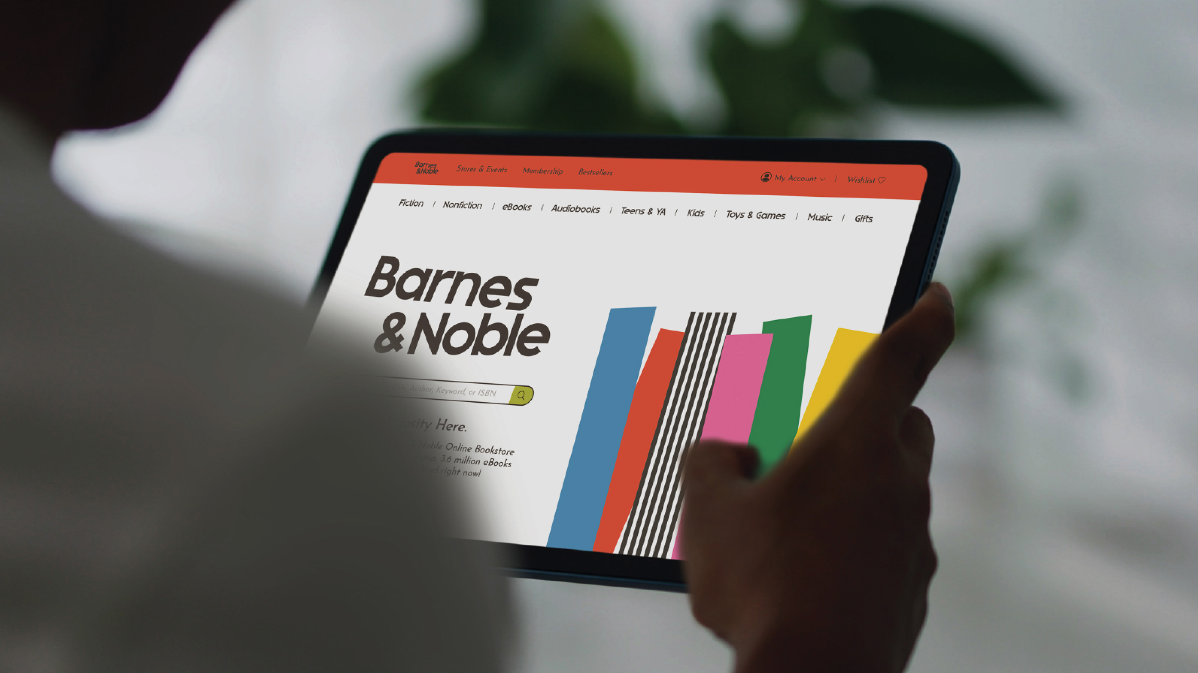
Brand Application
Flexible, scalable, and built to tell stories
From storefront signage to in-store graphics and packaging, every touchpoint was designed with adaptability in mind. Color and type work in harmony, creating a brand system that feels alive—evolving, shifting, and telling new stories with every interaction.
The result is a design language that invites exploration. Whether you’re picking up a bestseller or wandering through indie shelves, the identity enhances the experience.


Conclusion
A new chapter begins
This rebrand is more than a visual update—it’s a love letter to books, readers, and the spaces that bring them together. By blending literary heritage with bold, modern design, Barnes & Noble steps confidently into its next chapter.