

Luminescence — Saddleback College Fashion Show
Project Overview
Saddleback College’s annual fashion show is a highly anticipated event, bringing together creativity, innovation, and student talent. I was invited to create a full event identity for the 2025 show titled Luminescence, including a hero poster, a set of digital assets, and a slideshow presentation. The design needed to be vibrant, dreamy, and modern, capturing the energy and aura the students envisioned.

The Challenge / Brief
When meeting with the fashion students, they emphasized wanting a vibe that felt vibrant, dreamy, and almost cosmic. Keywords like aura, energy, and vibrancy surfaced again and again. Reviewing past show materials, I noticed an opportunity: this year’s identity could push past traditional visuals and lean into something more abstract, modern, and unexpected—setting a fresh tone for the event.
Concept & Direction
I wanted to capture the essence of "luminescence" without being literal. Research led me to visual themes around light diffraction, refraction, and aura-like energy fields. I envisioned an identity that felt sleek and modern, with an otherworldly feel. The goal: create something instantly striking that could anchor the excitement of the show while giving it a distinctive new look.
Sketching Type Layouts & Visual Ideation
Before moving to final designs, I spent time sketching different ways the event name Luminescence could live on the page. I explored type arrangements that could feel structured yet energetic—testing out stacked layouts, justified grids, and off-axis compositions.
Throughout ideation, I kept returning to the keywords aura, vibrant, and energy—asking: how could the type itself feel illuminated and alive without relying on heavy effects?
Experimenting with tight grids and clean Swiss modern typography gave the text a luminous, polished quality. From there, I transitioned into digital comps, layering type treatments and visual elements to test how different combinations could amplify the mood and strengthen the overall identity.
Visual Identity Development
The main visual: a fractured, rainbow-hued glass orb, semi-transparent and alive with shifting colors. This orb symbolized both the idea of light bending through a prism and the vibrant individuality of the designers showing their work.
The sharp contrast between the stark, aligned typography and the glowing, organic orb created a dynamic tension—elevating both elements.
Across digital and physical applications, I kept the visual language tight: black backgrounds, white text, and strategic placement of the rainbow orb, allowing the identity to feel cohesive, clean, and memorable.
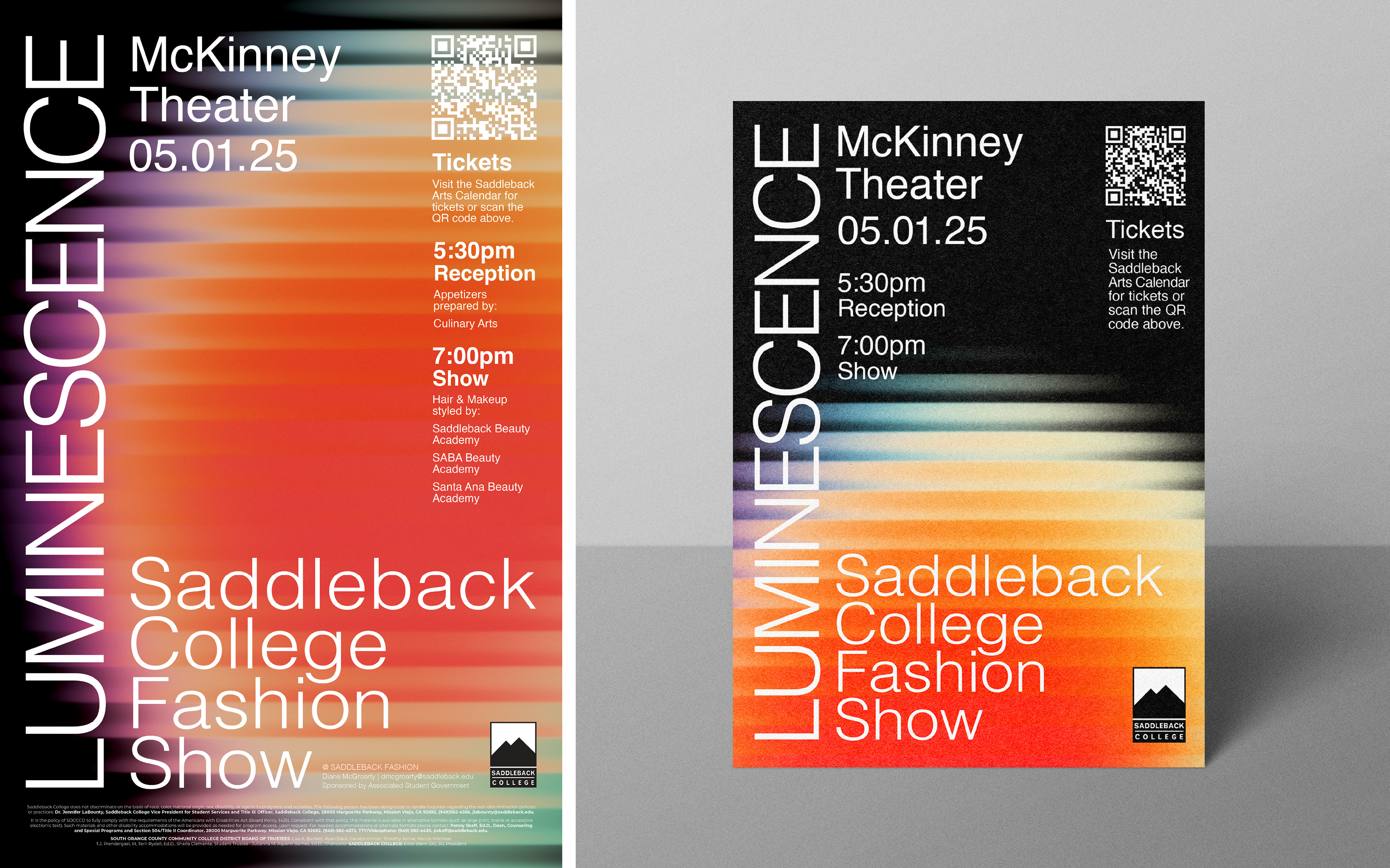
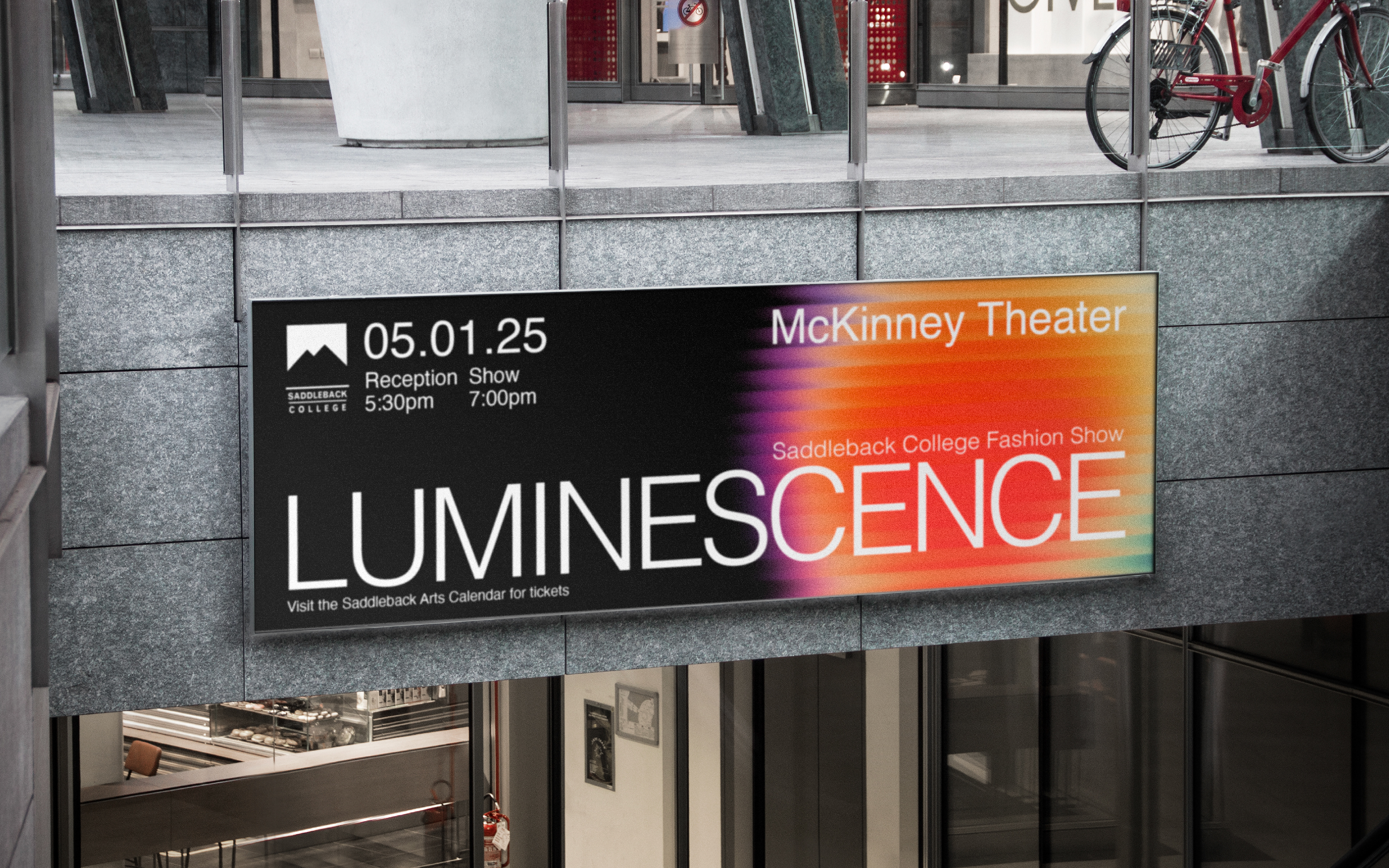
Brand Application
The poster served as the anchor of the event identity—a bold, eye-catching visual that set the tone for every other asset. From this core piece, I extended the design system into a suite of applications that felt cohesive and unified. A coordinating flyer was distributed around campus to build early excitement, while digital marquee graphics lit up campus screens leading up to the day of the show, reinforcing the vibrant, energetic theme.
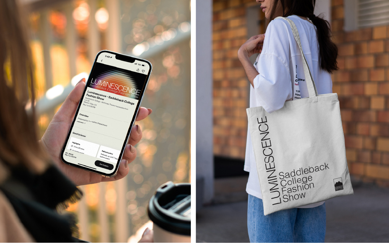
Across digital platforms, the identity extended to Eventbrite banners and social media graphics, maintaining a consistent look and feel from the first announcement to final ticket sales. To create a lasting keepsake for the students, I also designed a tote bag featuring only the bold poster typography in black, offering a minimalist, stylish reminder of the event.
Each application echoed the same core visual language: high contrast, clean typography, and the luminous energy of the rainbow glass orb—creating a strong, unified presence across every touchpoint.

Conclusion
Designing the identity for Luminescence was an exciting challenge—to capture vibrant, cosmic energy in a way that felt refined and modern. Through thoughtful exploration of type layouts and visual ideation rooted in the themes of aura, energy, and vibrancy, the final identity created a memorable visual experience that resonated with both the students and the audience.
Once the posters and digital assets were released, the event saw ticket sales move faster than in previous years—a clear sign that the fresh, striking visuals helped generate excitement and anticipation. The final system honored the students' vision while elevating the fashion show’s presence with a bold, cohesive, and future-forward identity.