

Care Corner Rebrand - A friendly new brand identity for a college care center
Care Corner is a dedicated facility at Saddleback College that provides comprehensive health and wellness services to students. Despite its importance, many students didn’t even know it existed. The goal was to change that with a brand that feels approachable, inclusive, and easy to navigate.
Project Overview
The rebranding of Care Corner focused on creating a visual identity that reflects the center’s commitment to fostering a supportive, inclusive, and welcoming environment. The goal was to build trust and approachability through design—ensuring students felt seen, valued, and cared for the moment they encountered the brand.
The Challenge
Lack of visibility. Low awareness. Cluttered communication.
Students were unsure where to go or what Care Corner offered. The center had no recognizable signage, and information about its services was scattered and hard to digest. There was a real need to unify its presence and make it easier for students to find help when they needed it most.
The Goal
Build trust. Feel warm. Be seen.
The goal was to create a visual identity that feels approachable, inclusive, and reassuring. Care Corner needed to be more than a physical space—it had to feel like a part of the student community. The brand needed to inspire confidence while remaining warm, open, and professional.
Concept & Direction
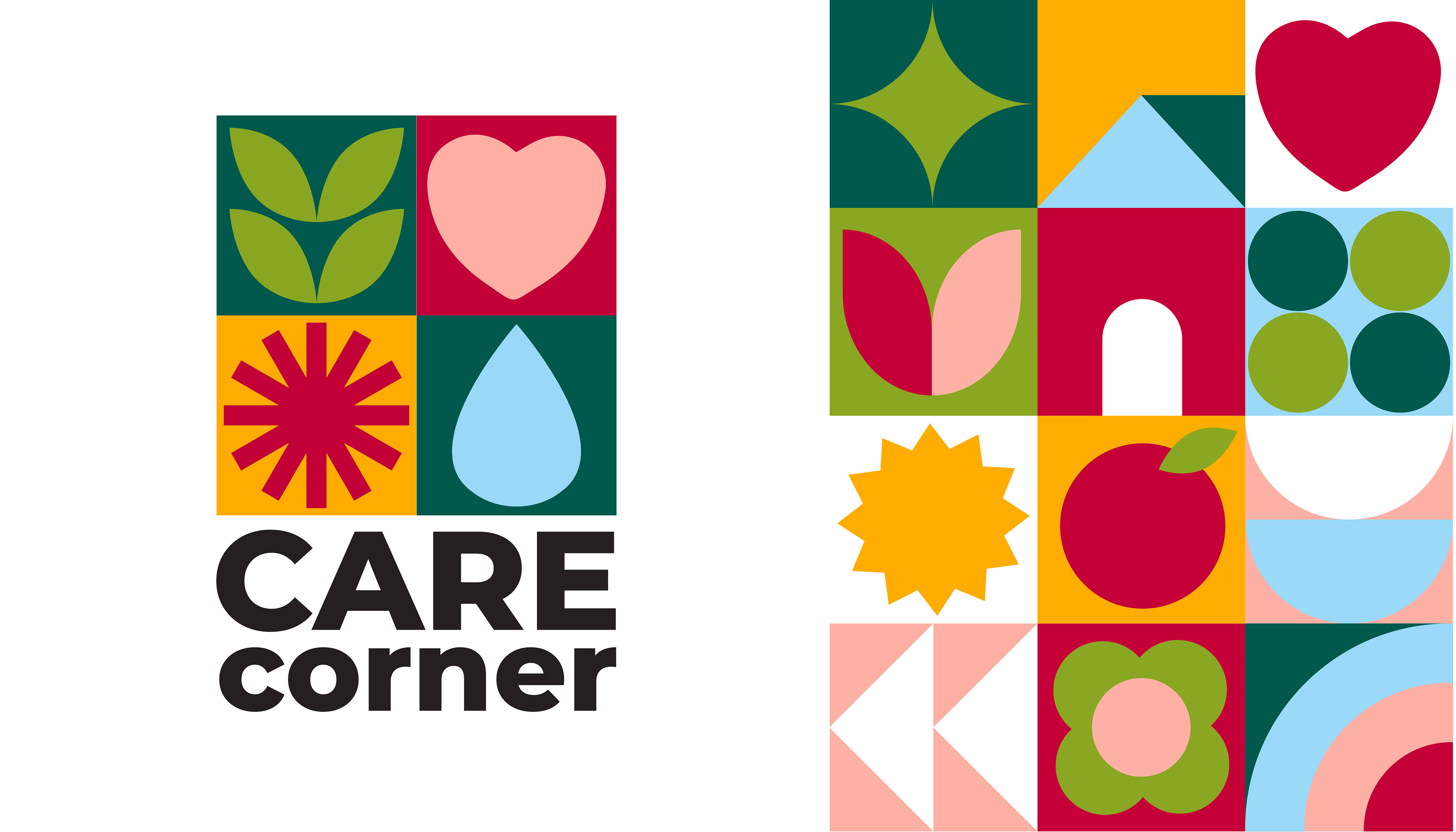
The rebrand focused on clarity, warmth, and friendliness. Minimalist icons were designed to be easily understood and to help students feel welcomed. Communication materials were simplified and consolidated into clean posters and window graphics that are quick to read and easy to follow.
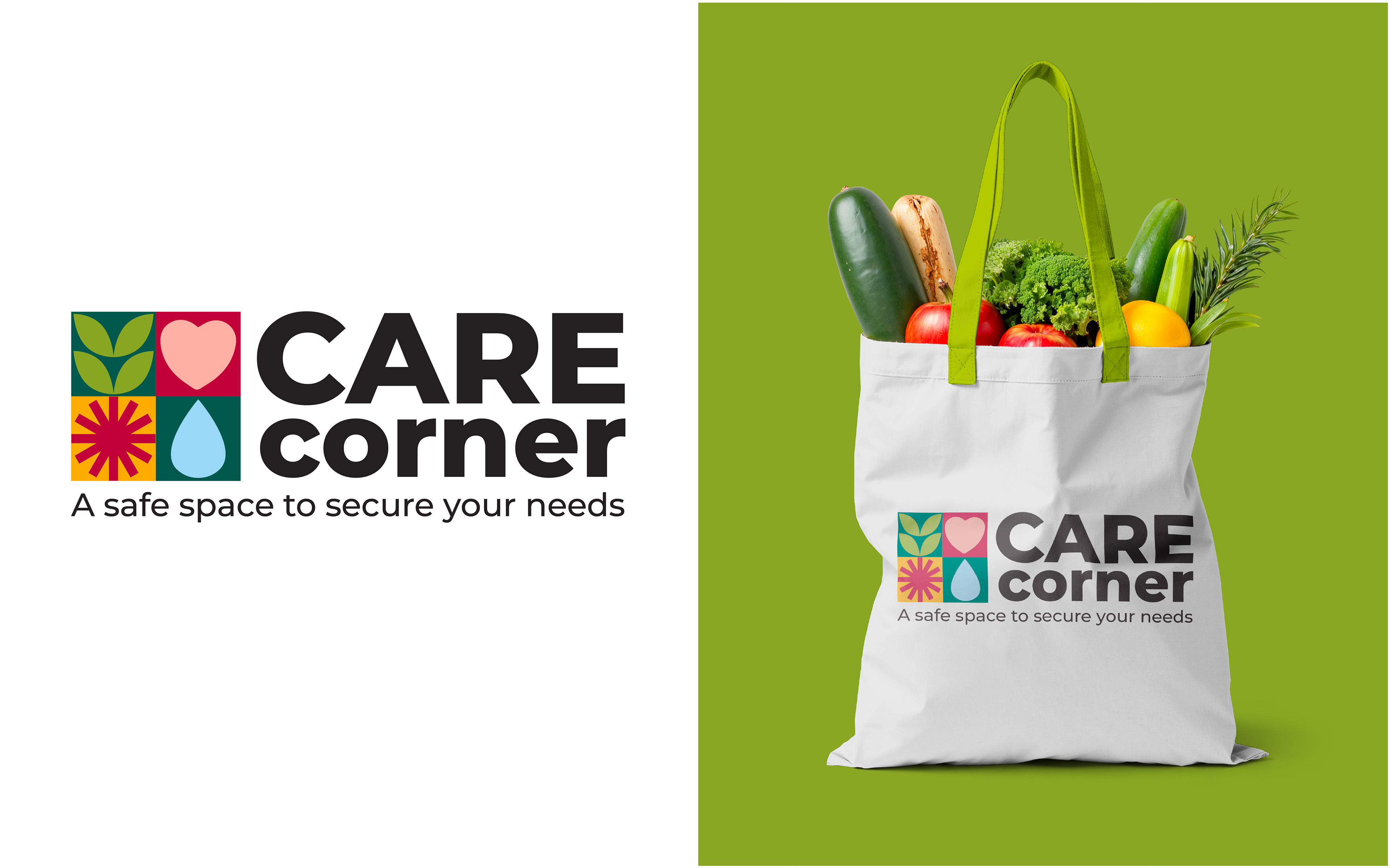
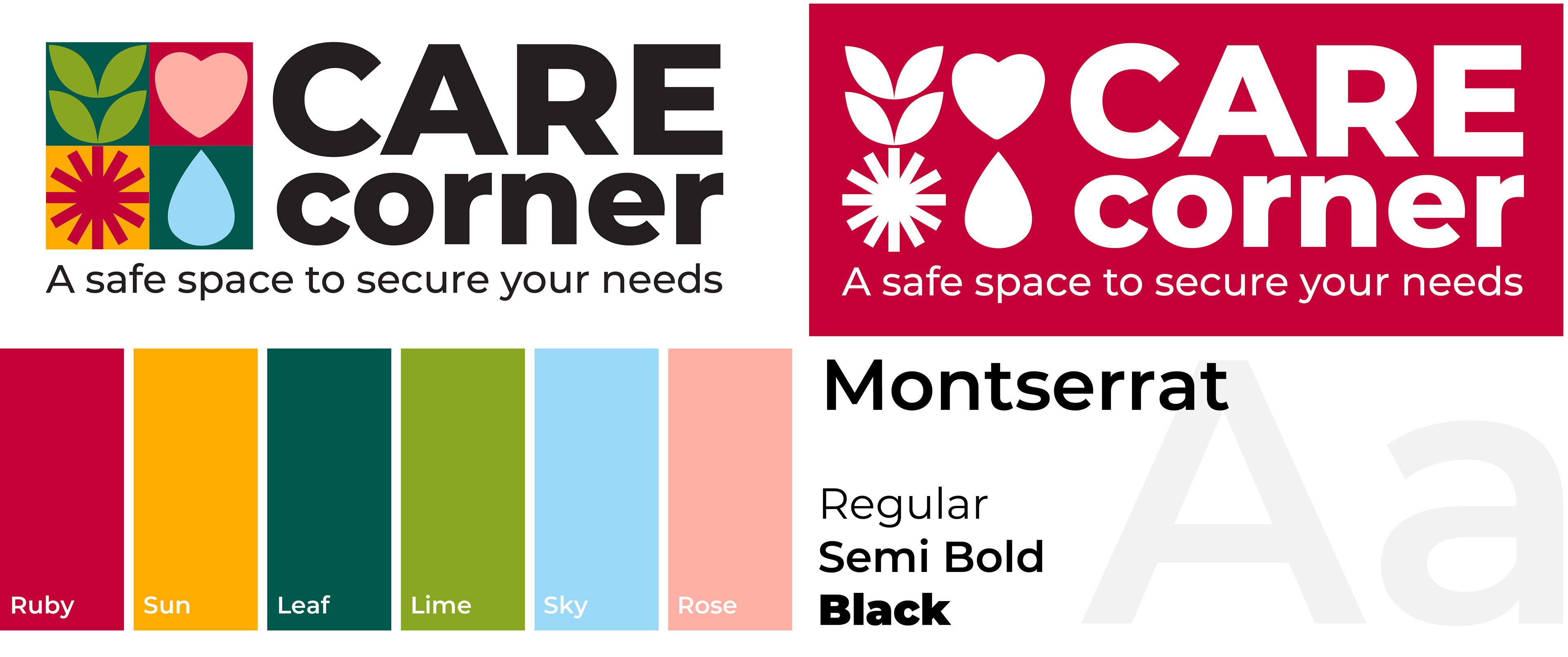
Visual IdentityThe new look is warm and approachable, using the college’s signature red with vibrant, supportive tones. A modern sans serif font keeps everything legible and professional without feeling cold. Simple geometric shapes add structure and personality, while custom icons clearly represent different services and help communicate to students what the center offers.
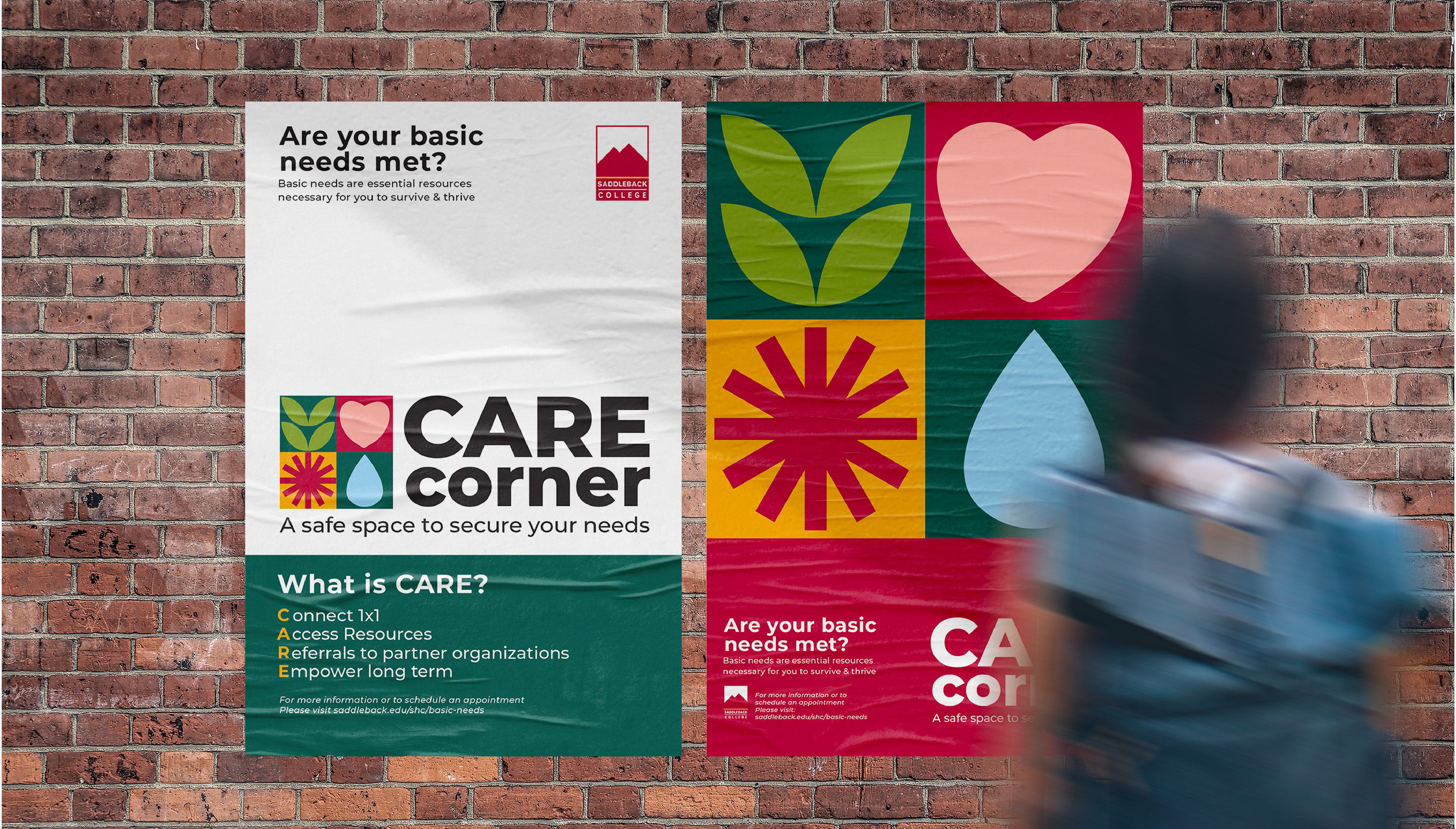
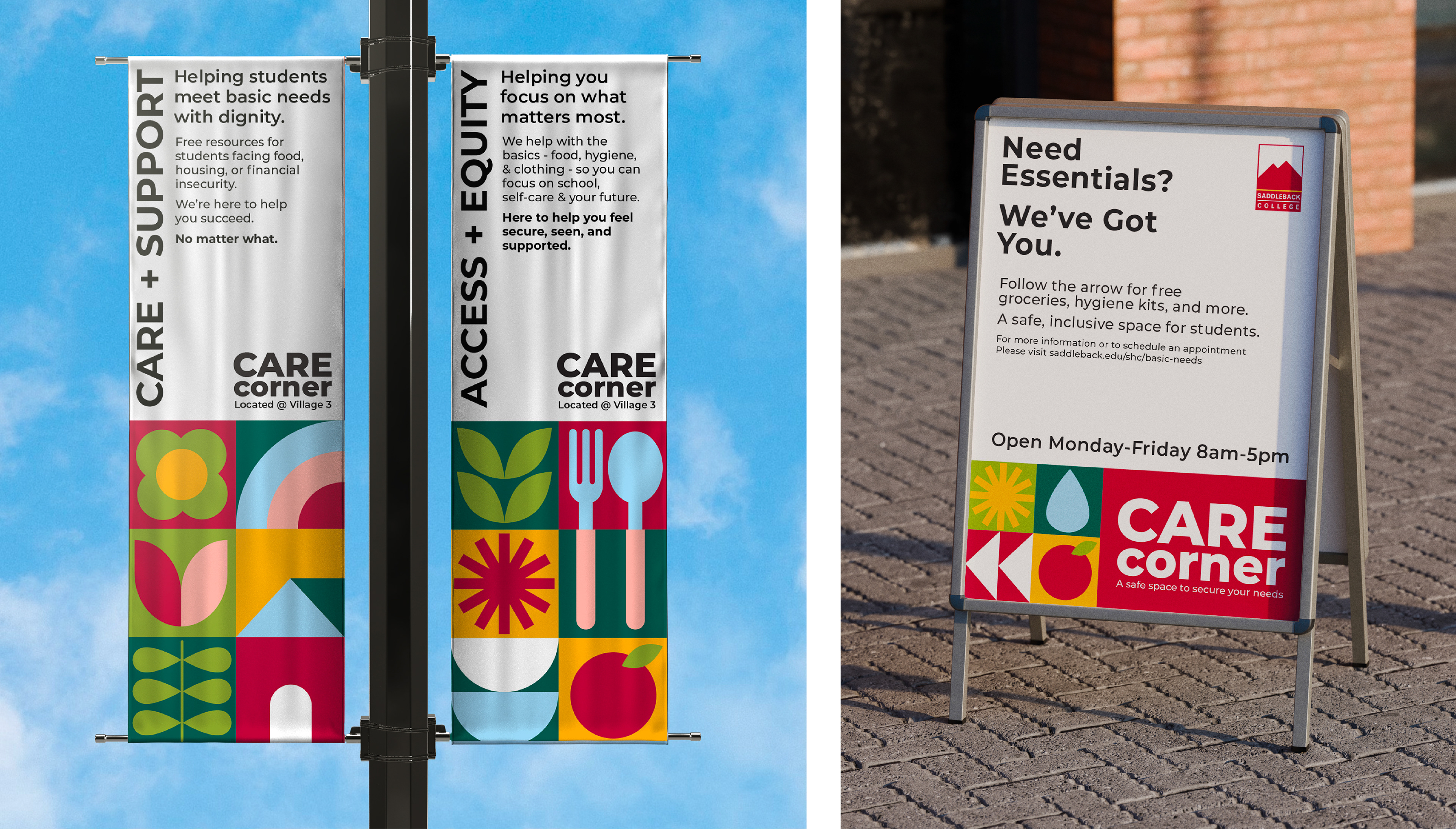
Way-finding & Signage
From overlooked to easy-to-find.
One of the biggest transformations came through physical signage. New posters, directional signs, and visual cues now guide students through campus and into the Care Corner space. Important health and wellness information was restructured into easy-to-read formats, helping students quickly understand what’s available to them.


Brand Applications
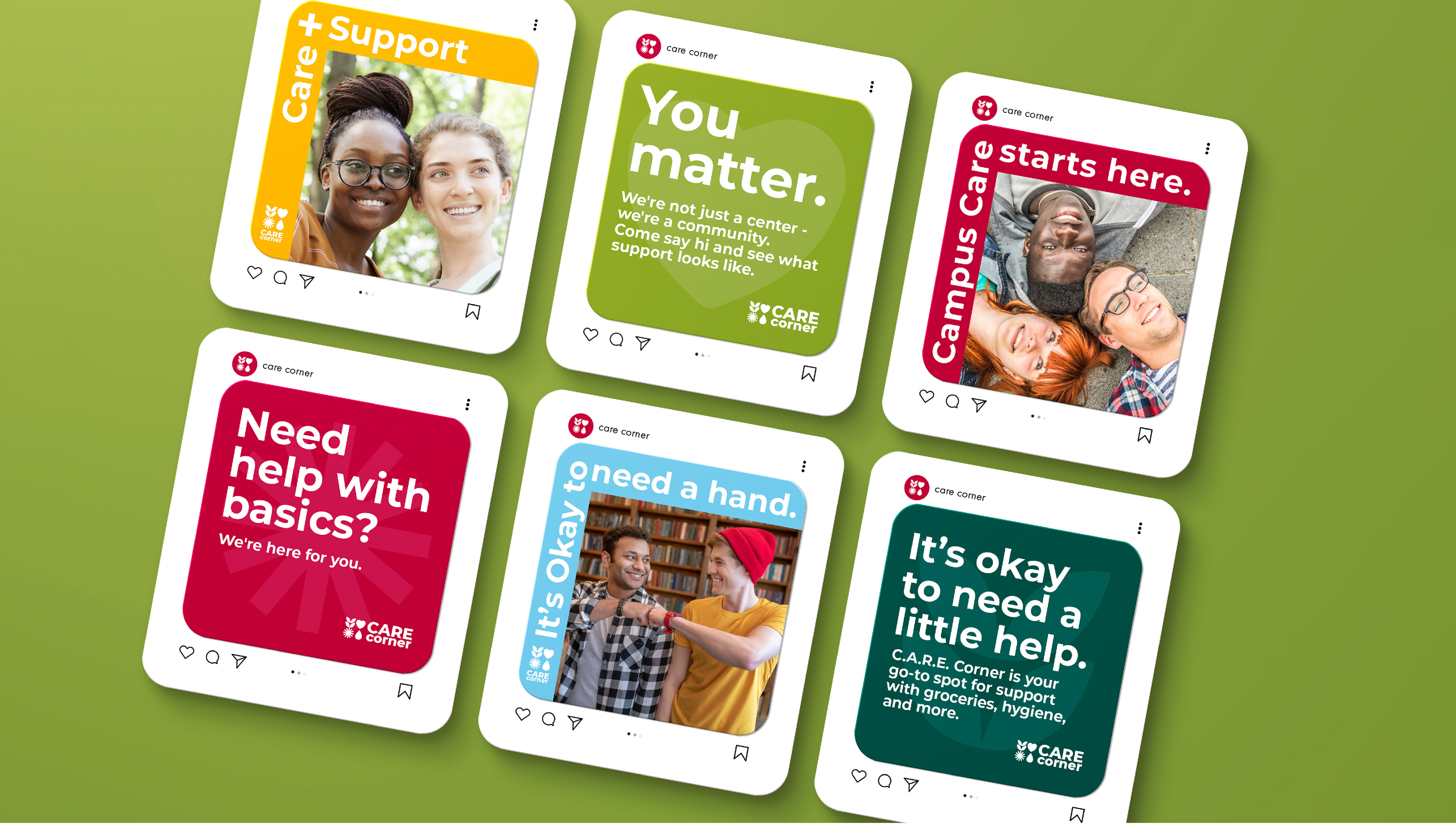
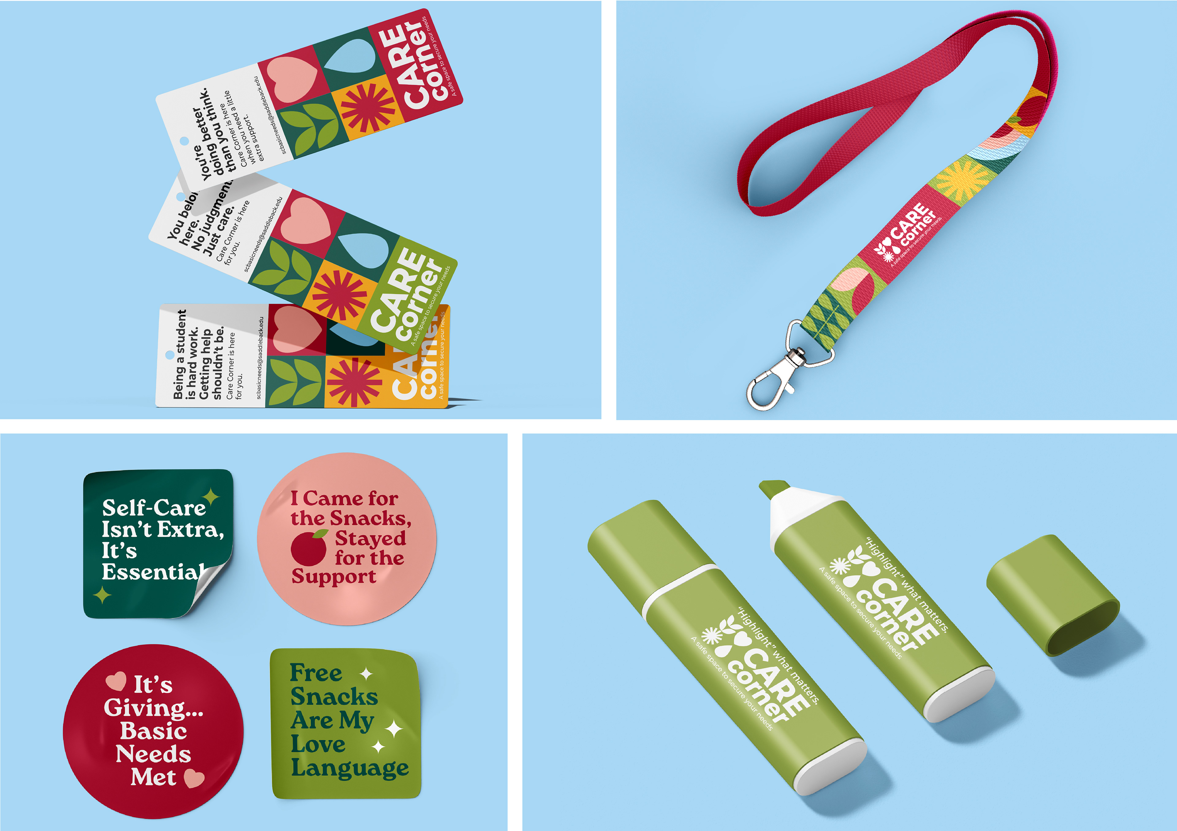
To make Care Corner more visible and approachable, I extended the identity across a range of touch points—both physical and digital.
Large-scale wall graphics welcome students into the space, while staff t-shirts and tote bags create a consistent, friendly presence. The identity also lives on social media, with branded templates designed for quick updates and wide reach. To keep the brand top-of-mind, I designed a set of student giveaways—stickers, pens, bookmarks, and lanyards—that are fun, useful, and easy to engage with.
Each piece is designed to meet students where they are—making the brand feel present, helpful, and part of campus life.


Conclusion
The rebrand gave Care Corner a welcoming presence on campus. With clearer messaging and a cohesive identity, the center is now easier to find—and easier to connect with. It’s a space that feels more inviting, which means more students can access the care and support they need.