
Fira — A Celebration Without Alcohol
Designing a bold and joyful brand identity for a Swedish beverage company that turns every moment into a celebration. Fira brings the fizz, flavor, and fun—no alcohol required. This visual identity blends Swiss modern clarity with playful graphics and rich color to create a refreshing take on indulgence.
Project Overview
Fira is a non-alcoholic beverage brand born just outside Stockholm, Sweden. Its name—Swedish for "to celebrate"—encapsulates the essence of the brand: elevating everyday moments into something worth toasting.
This project focused on creating a bold, vibrant brand identity that redefines what alcohol-free indulgence can look and feel like. The goal was to design a visual world that feels effortlessly chic, playfully inviting, and perfect for design-conscious adults who know that good taste isn't limited to what's in your glass.

The Brief
The brief presented a clear yet exciting challenge: create a visual identity that reflects their mission to celebrate life—without the booze.
They wanted a brand that could confidently stand on the shelves next to artisanal wines or craft cocktails, but also bring something entirely fresh to the table. The identity needed to signal quality and creativity while remaining playful, colorful, and inclusive.
Concept & Direction
The creative direction was driven by contrast: bold yet refined, playful yet polished. I drew inspiration from Swiss modern design for its striking typographic clarity, then layered in bursts of vibrant color and whimsical graphic forms to capture Fira’s celebratory nature.
The result is a balance of structure and spontaneity—much like Fira itself, which turns any moment into a chance to raise a glass (sans alcohol).
Visual Identity Development
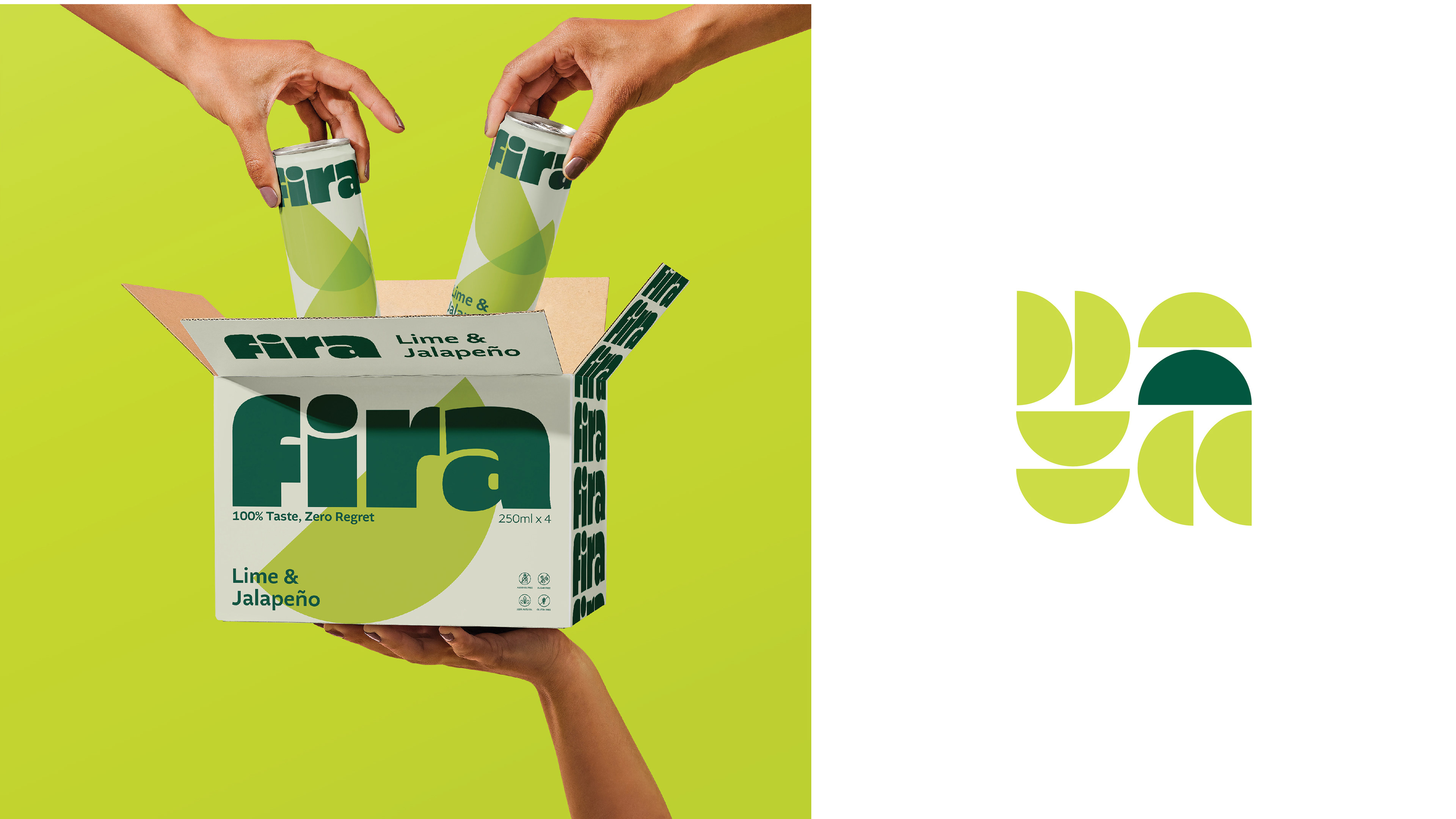
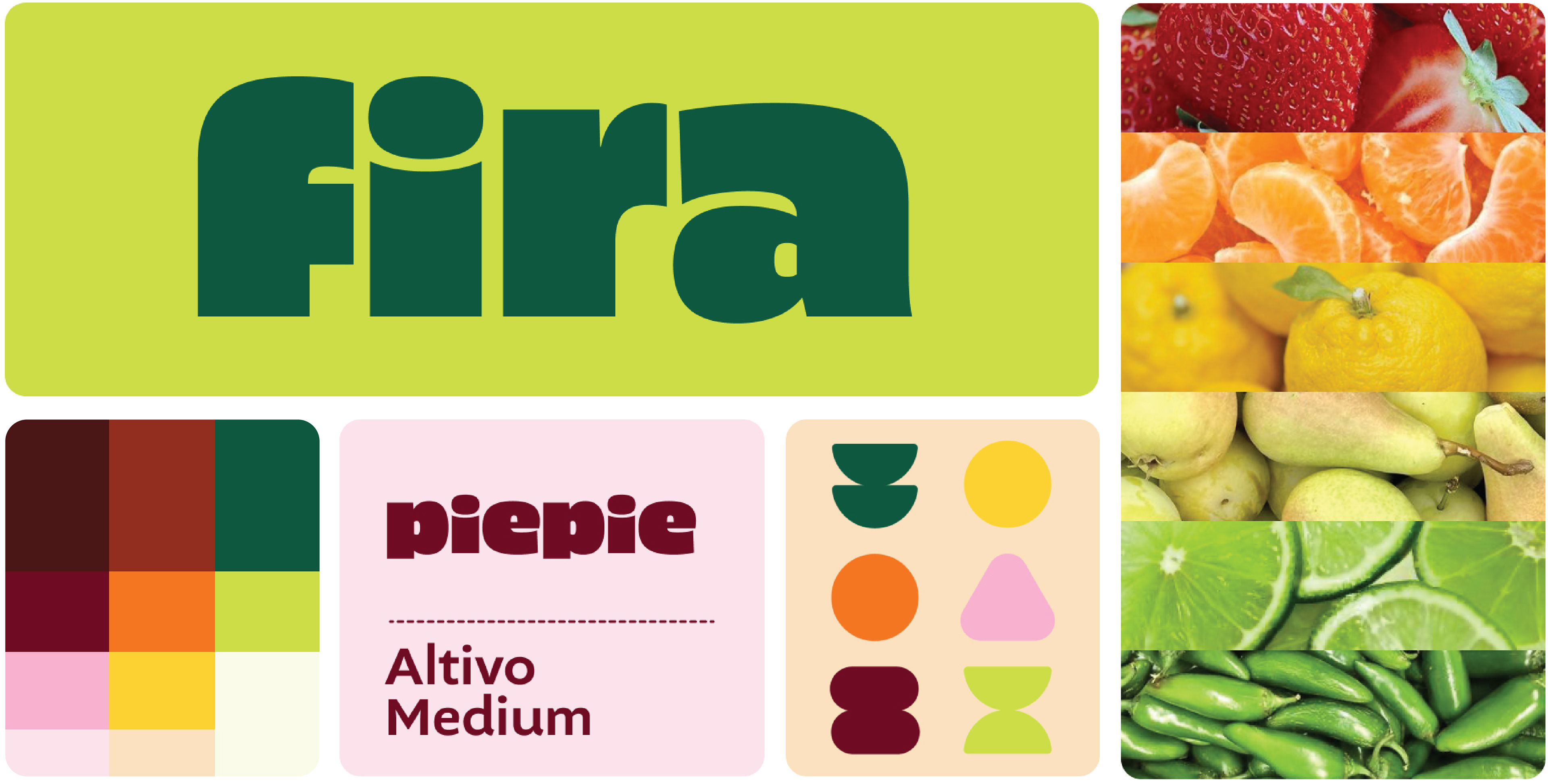
At the core of the identity is the Fira word-mark: a modern sans serif with playful proportions and a bold weight. It’s confident, legible, and just quirky enough to feel uniquely expressive.
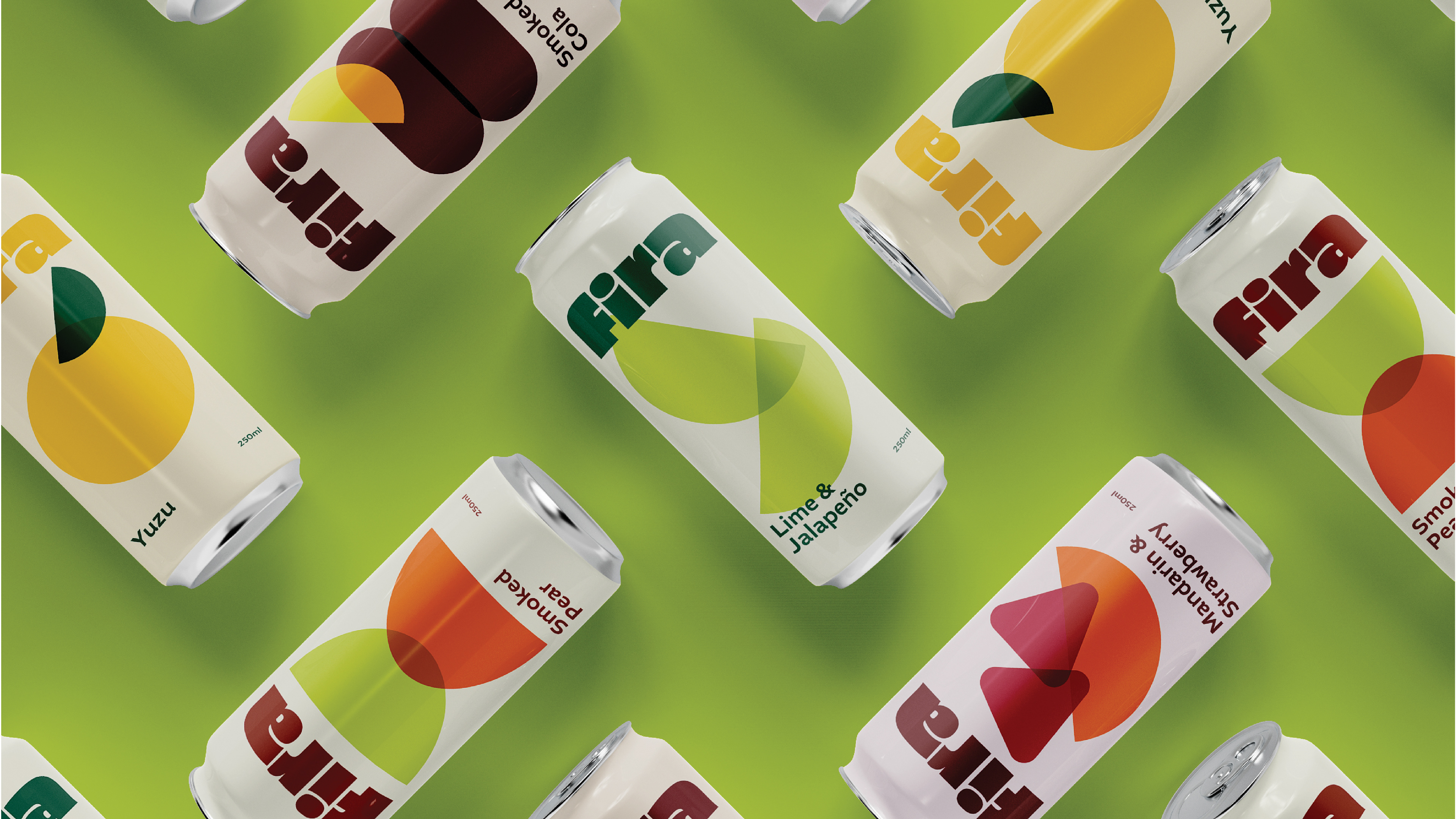
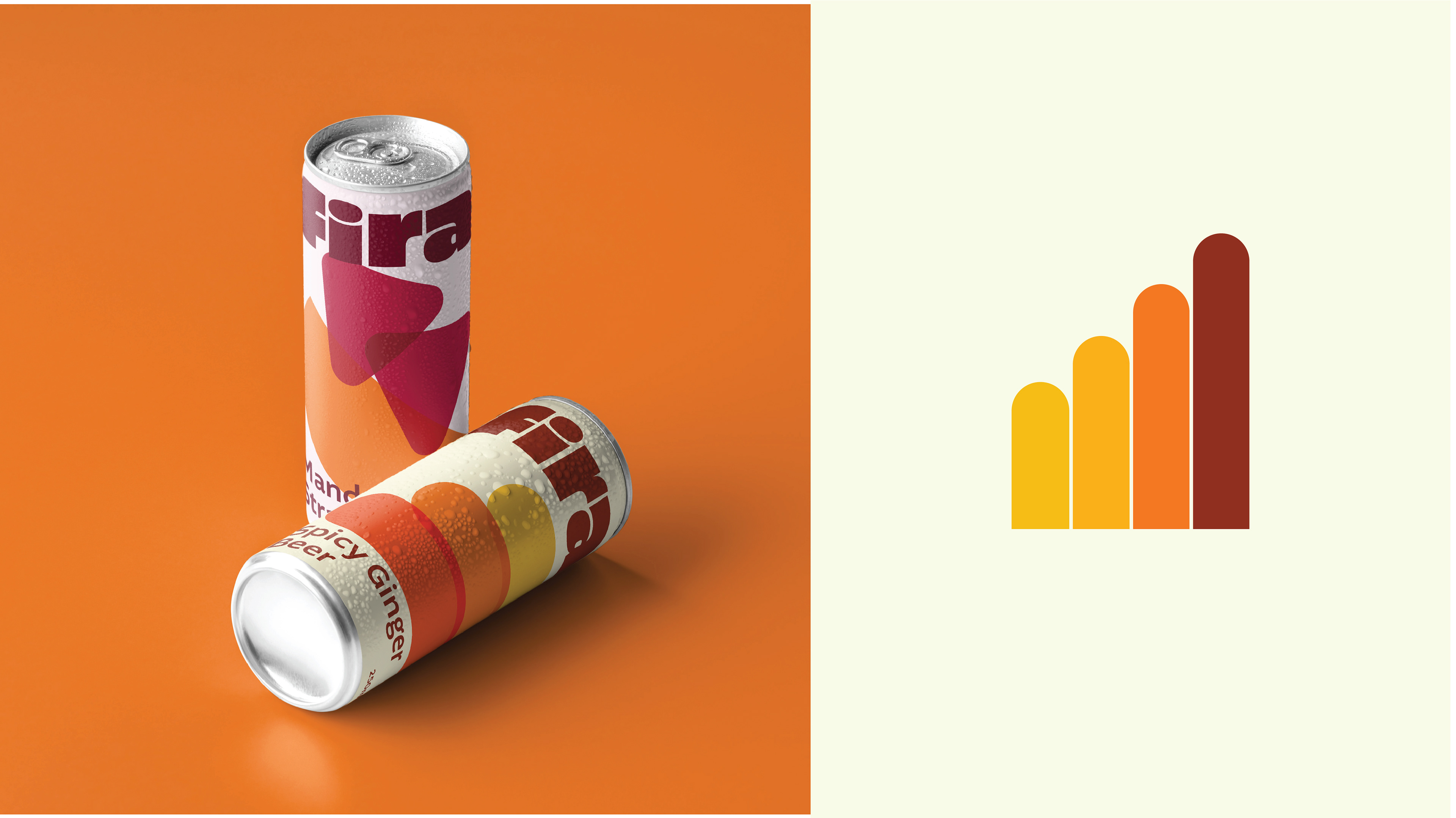
A bold, modern identity for a non-alcoholic beverage brand that celebrates in style. With a palette of berry red, citrus orange, sunlit yellow, lime green, and cola brown, Fira feels fresh, vibrant, and full of life. Minimalist fruit shapes and organic forms overlap with playful transparency—creating a visual rhythm as layered and lively as the flavors themselves.
Typography choices complement the logo with clean sans serifs and high-contrast pairings that maintain legibility while reinforcing the brand’s modern edge.

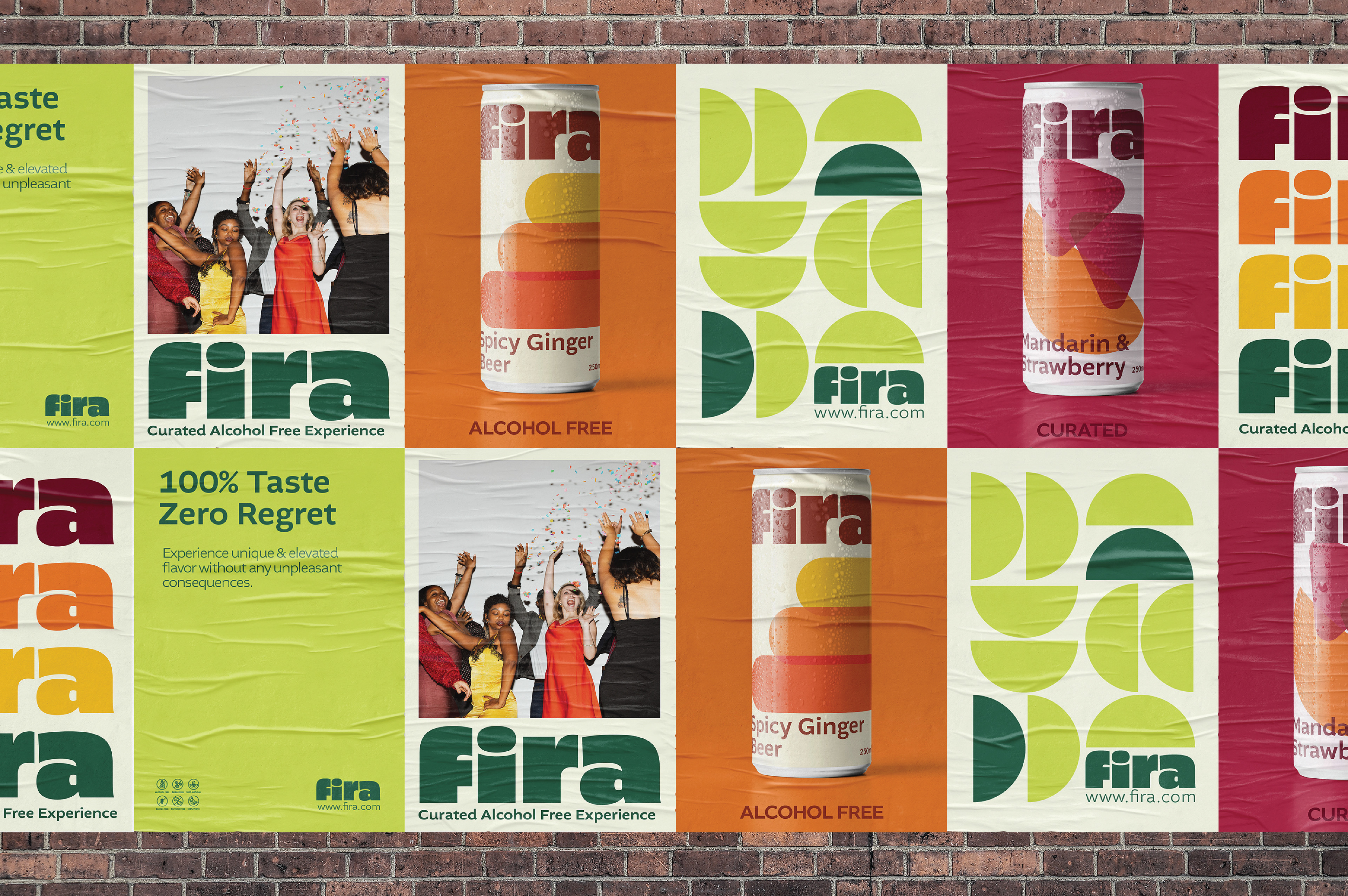
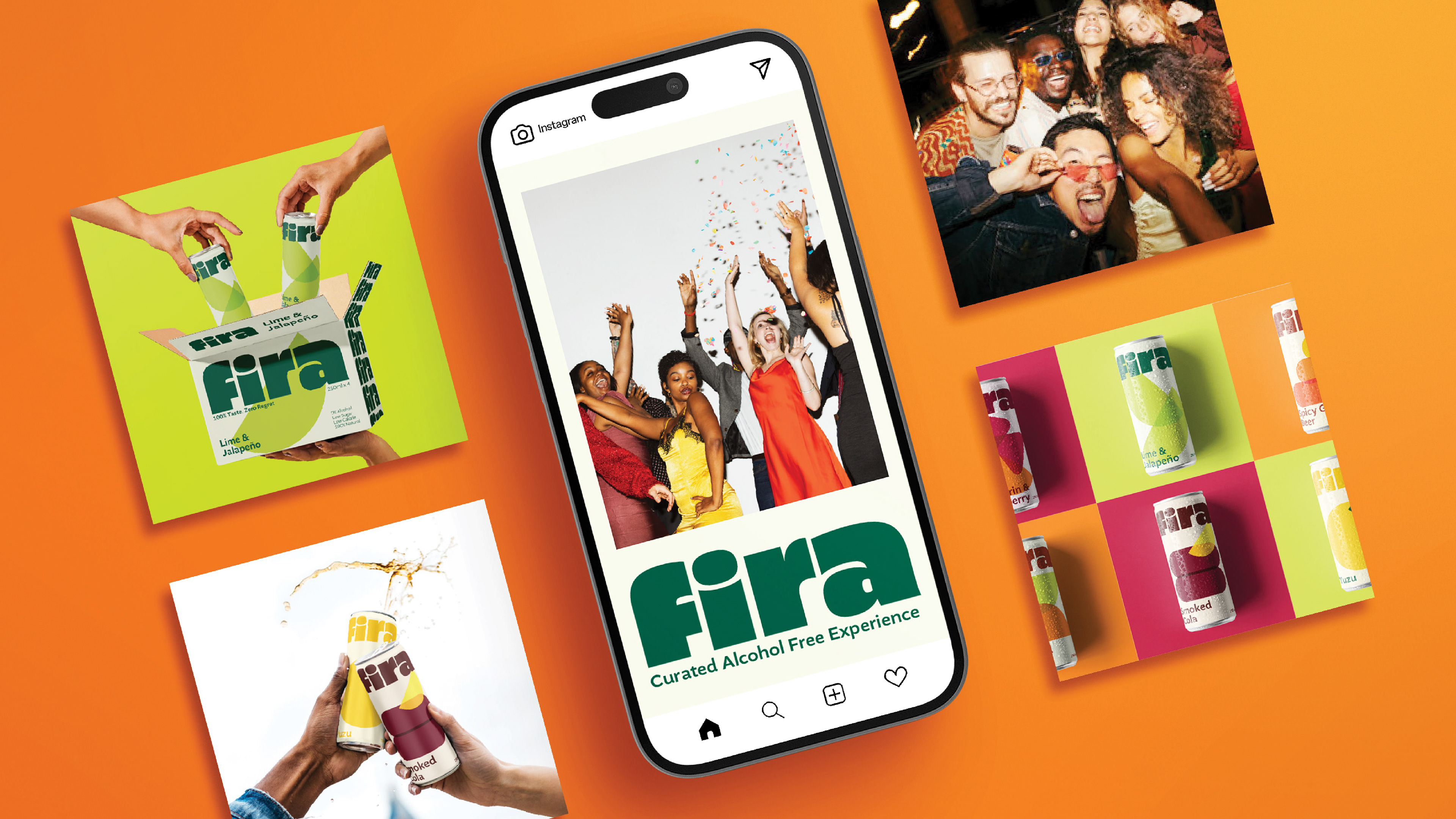
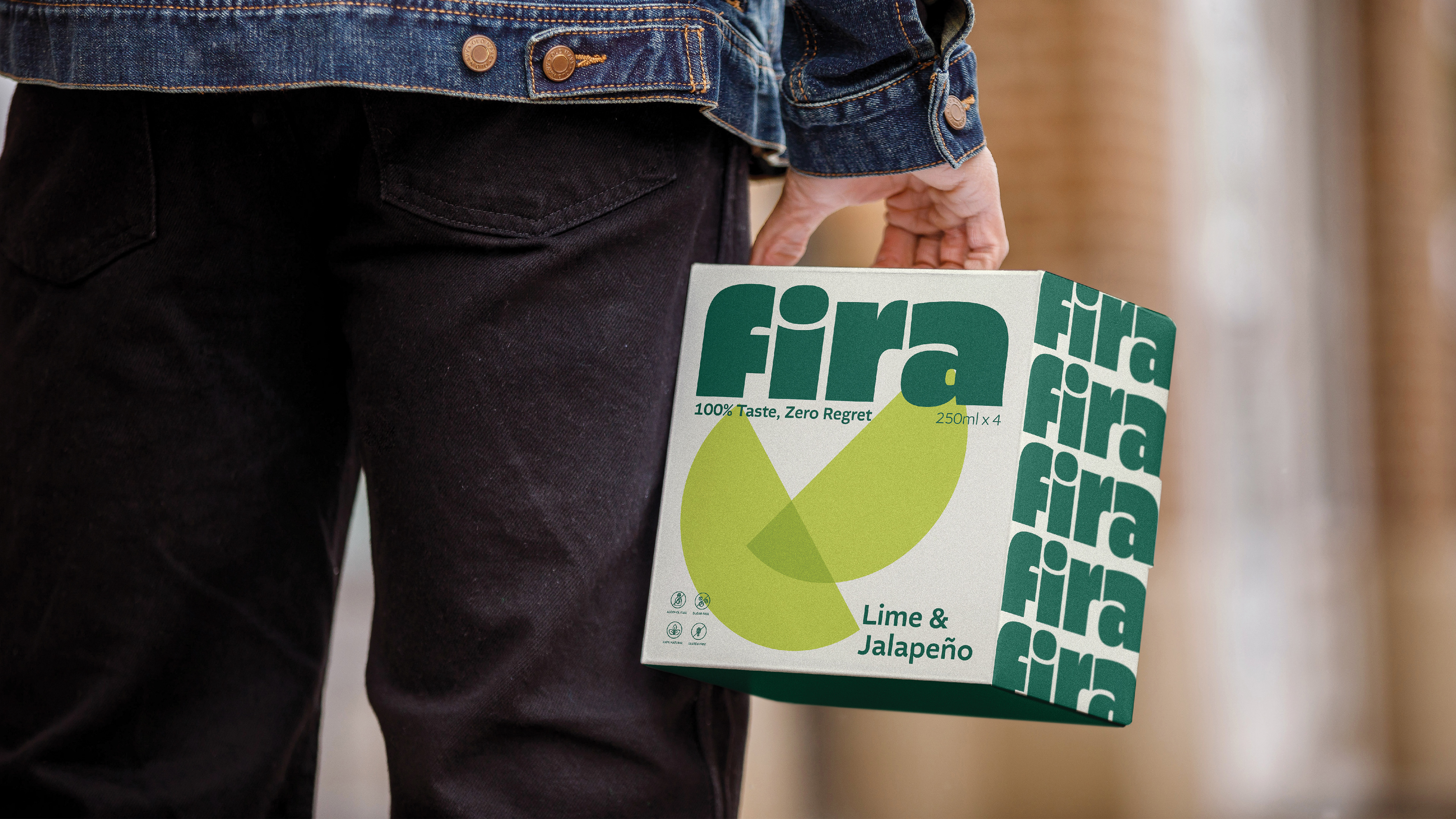
Brand Application
Fira’s identity unfolds across every touchpoint, starting with its slim can packaging—each one a bold, eye-catching object designed to stand out in any setting. Layered with translucent fruit-inspired shapes in vibrant hues, the labels create a sense of movement and depth, making every can feel like a mini celebration.
On social media, the brand comes to life through playful layouts, vibrant photography, and cheeky taglines that speak directly to design-conscious drinkers. Posters carry the look into the real world, combining rich color, minimalist forms, and bold typography to create striking compositions that invite curiosity—and a sip.


Conclusion
Fira isn't just a drink—it’s a feeling. The brand identity captures that spirit with a visual language that invites, excites, and inspires.
This project was a celebration in itself—a chance to blend form and flavor, elegance and energy. Fira proves that you don’t need alcohol to turn heads or raise a glass—you just need good design.