
AB Psych Rebrand - A Warm, Modern Identity for a Family-Focused Practice
Project Overview
The AB Psych rebrand was a complete transformation of an outdated and clinical identity into one that feels modern, warm, and family-centered. The goal was to create a brand that reflects the practice’s core values—honesty, collaboration, trust, and connection—while feeling inclusive, non-judgmental, and emotionally supportive for both parents and children.
The Challenge
The previous branding didn’t reflect the heart of the practice—it felt cold and impersonal. AB Psych needed an identity that could connect with families on an emotional level and build trust from the first glance.
From the earliest sketches to final applications, every design decision was rooted in the desire to create a space that feels safe, approachable, and full of personality. The result is a brand that not only represents the heart of the practice—but one that truly resonates with the people it’s meant to serve.
Concept & Direction
The rebrand was built around the idea of emotional connection. From early mood-boards to initial sketches, I focused on soft, welcoming forms that reflect approachability and care. The client wanted a brand that felt both professional and human—a space where families could feel at ease.
Logo Development
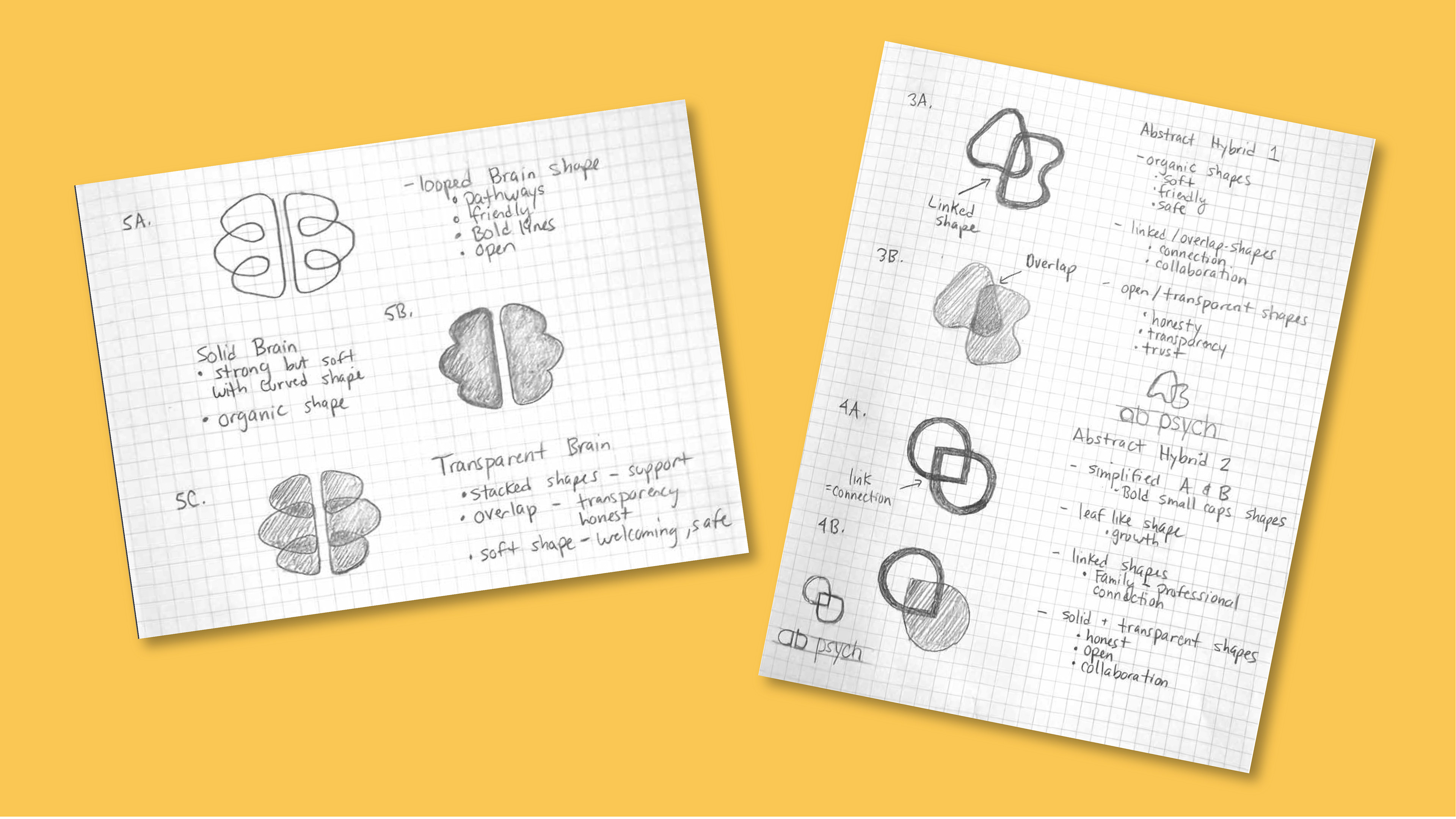
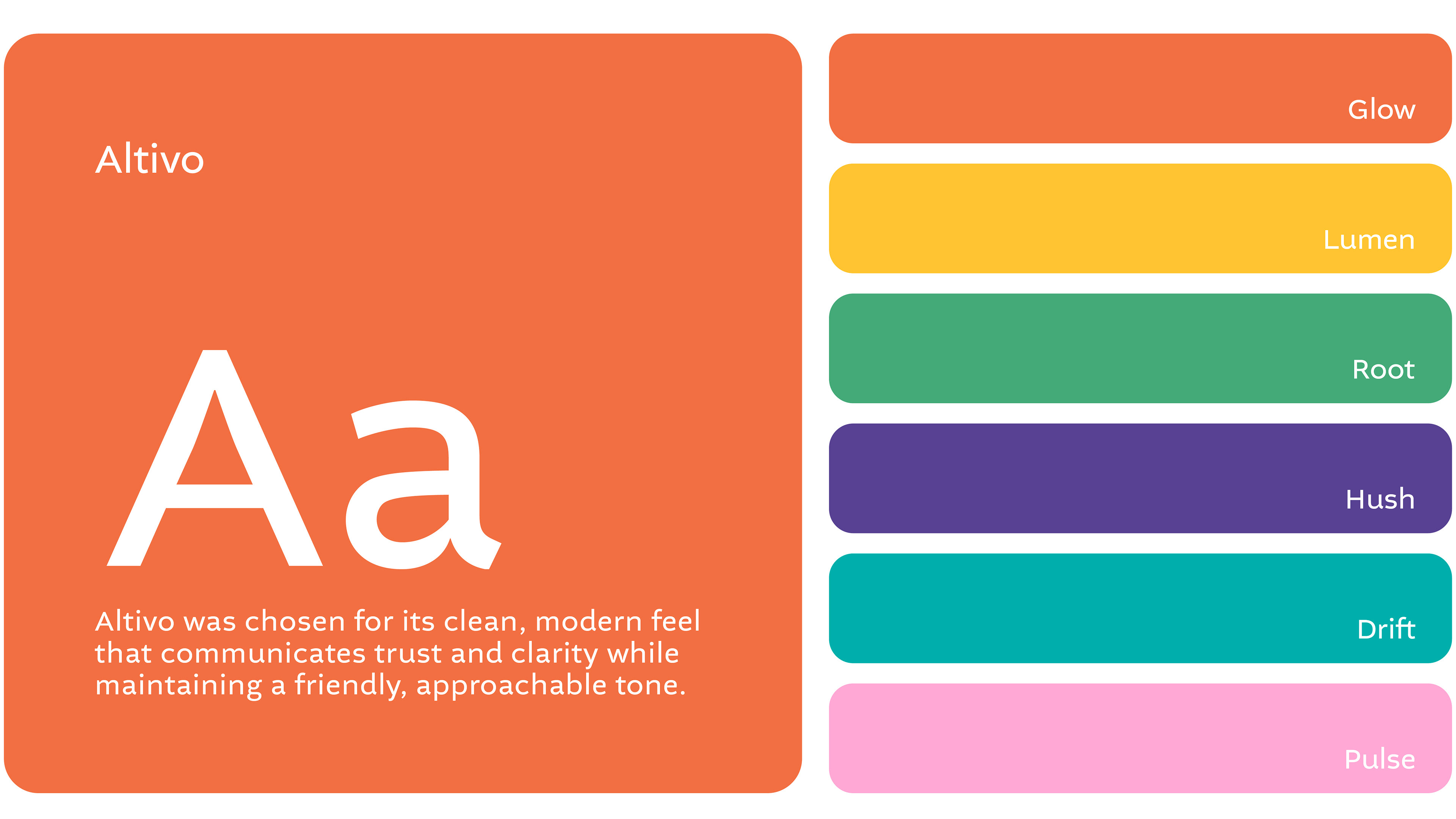
The logo served as a central piece of the new identity, a simple, modern doodle of a brain designed to feel both professional and playful. Inspired by the core brand values, I explored a range of organic shapes that communicated softness and warmth.
Through iterative sketching and experimentation, I leaned into rounded lines, overlapping forms, and subtle doodle-inspired elements to represent thoughtfulness, connection, and emotional openness. The result is a custom mark that feels grounded yet lighthearted — reflecting the practice’s shift toward a more human, family-focused experience.
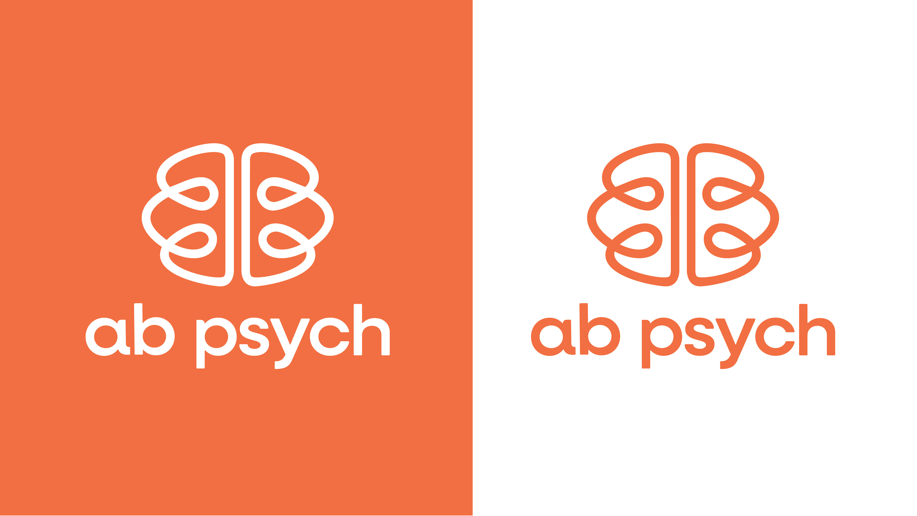
The Doodle
I designed the final logo with hand-drawn doodles in mind, the kind you might find in the corner of a notebook. I wanted it to feel warm, human, and approachable, so I used soft, flowing lines and overlapping loops to reflect connection, openness, and trust. The rounded lowercase type adds a friendly, modern touch that keeps the whole look light and inviting.
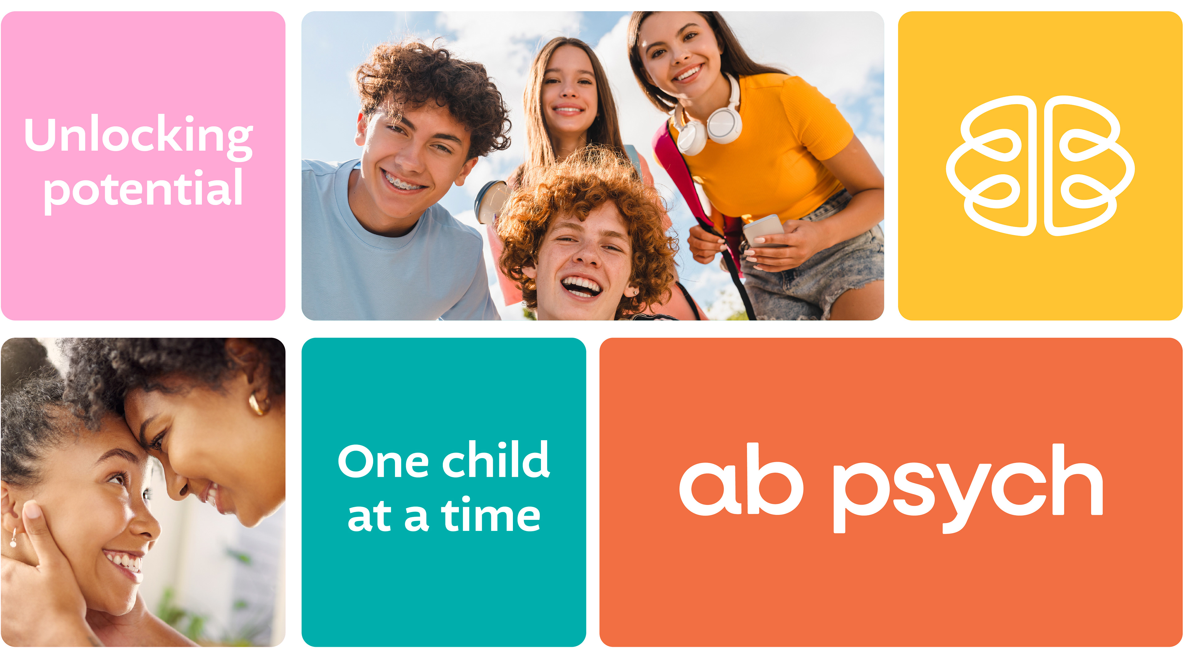
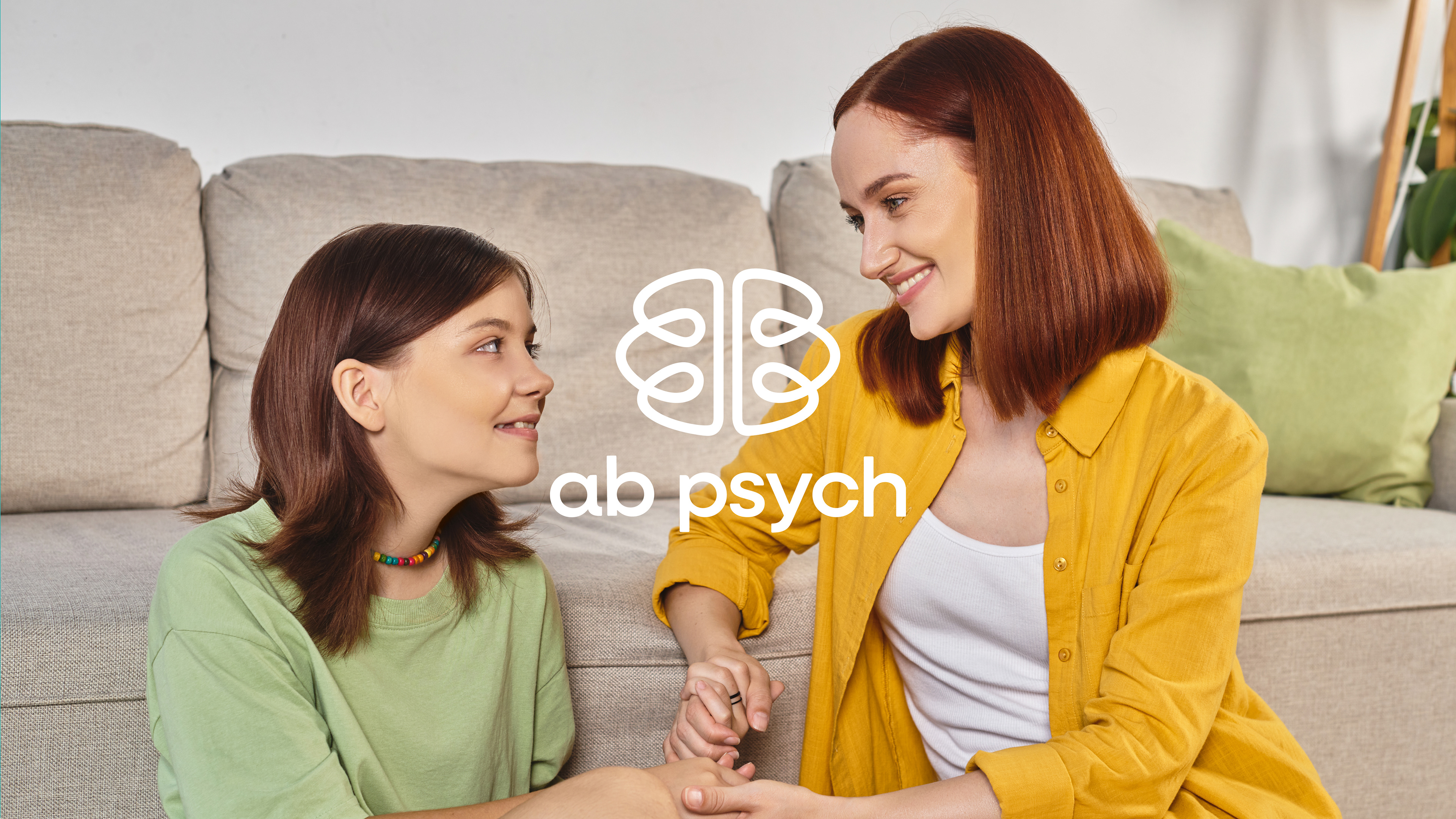
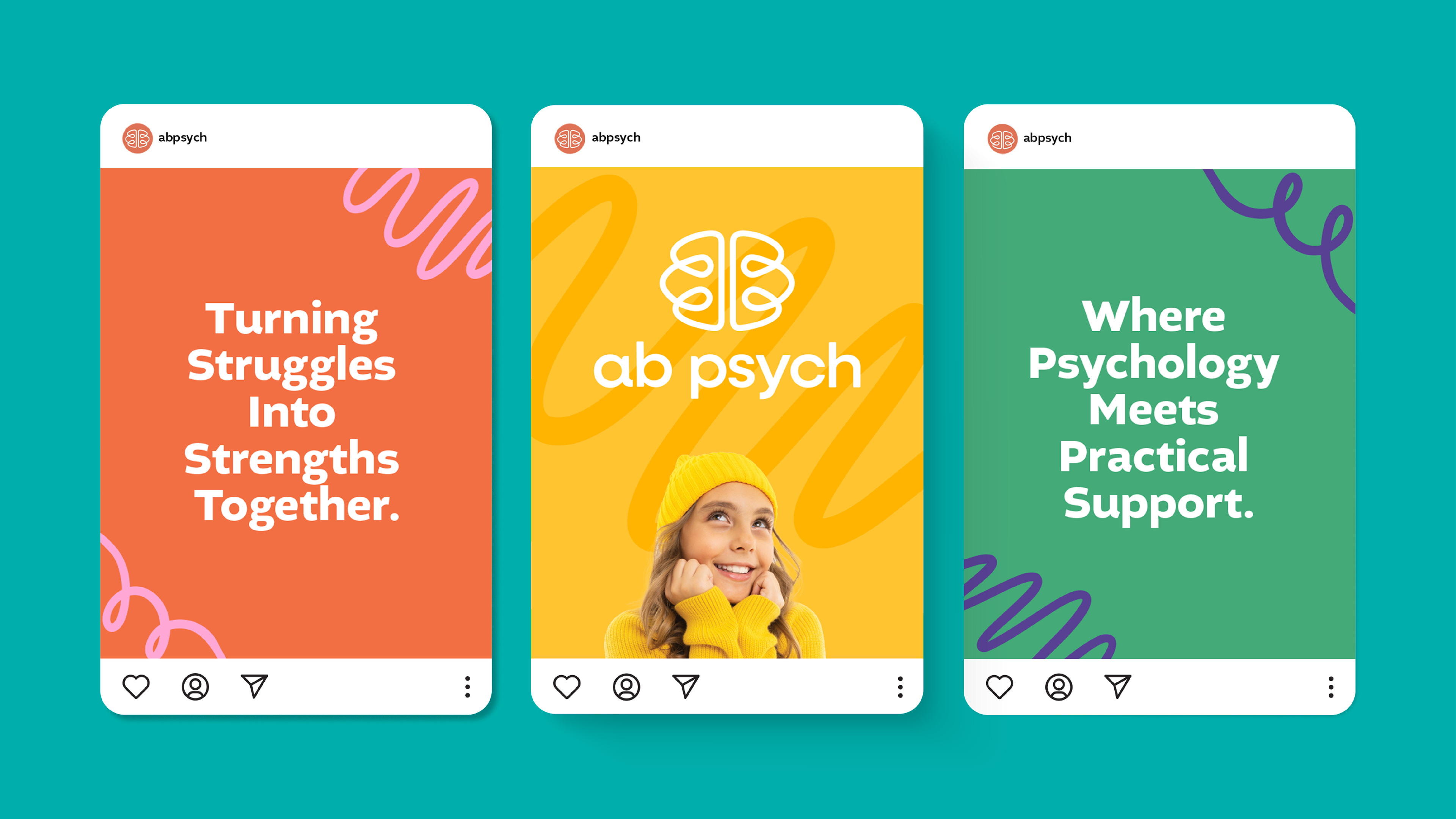
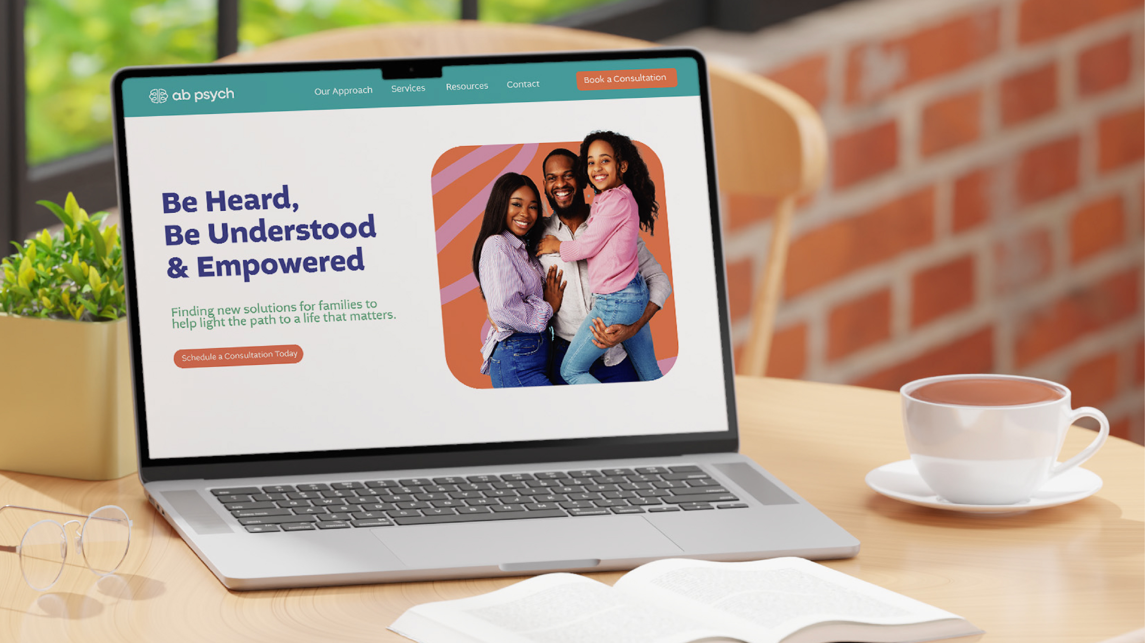
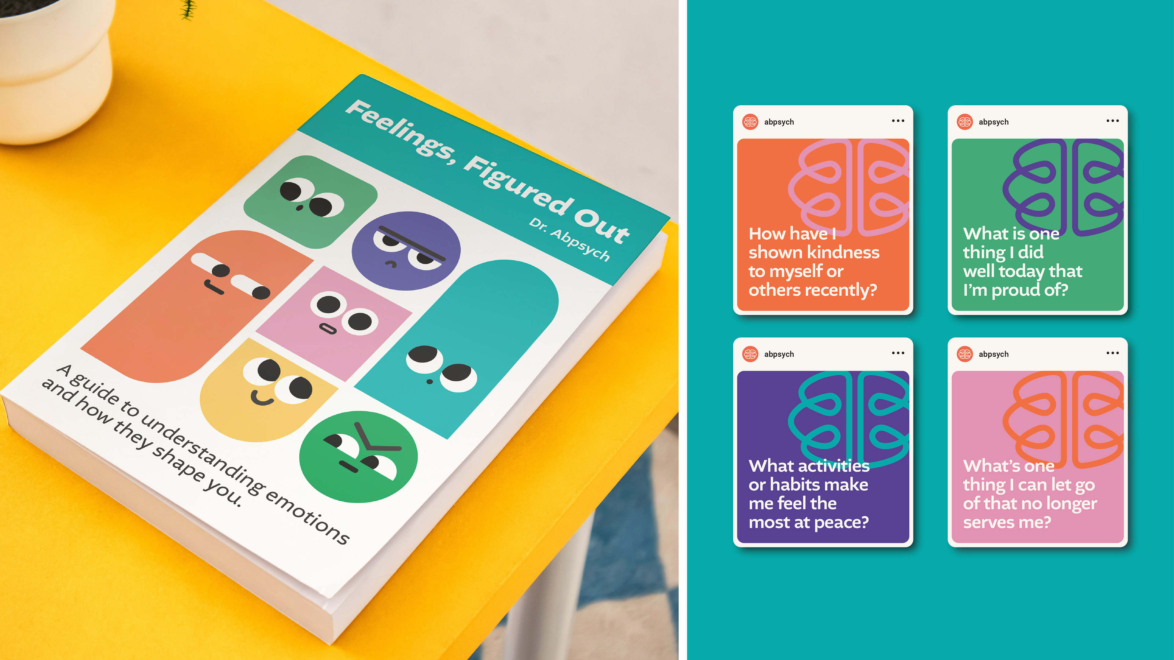
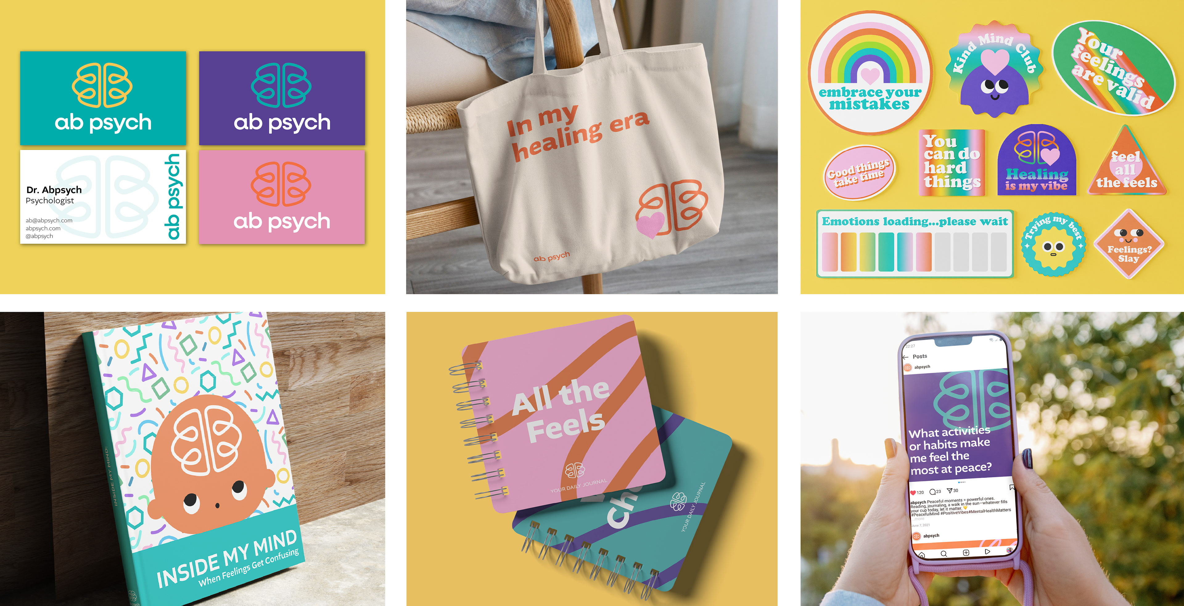
Brand Applications
I wanted every brand touchpoint—whether it’s print, web, or the little extras—to feel warm, thoughtful, and genuinely up lifting. From the start, the goal was to design something that sparks joy and builds connection.
Conclusion
This rebrand gave AB Psych a whole new presence—one that feels warm, modern, and full of personality. My goal was to create more than just a visual identity, but an experience that feels welcoming from the very first glance. Every detail, from color to type to shape, was designed to reflect emotional care and connection. When the client said, ‘The new brand has a real presence!’ I knew we’d built something that truly resonates