
Kati + Franki - Bold Identity for Modern Indian Street Food
Project Overview
Kati + Franki is a fast-casual restaurant concept inspired by the bold flavors and energy of Indian street food—centered around the beloved kati roll.
For this project, I developed the complete brand identity from the ground up. The goal was to create a visual language that feels fresh and modern, while honoring the rich traditions that inspired it. The result is a vibrant, approachable brand that’s full of flavor, both in design and in spirit.

The Brief
Design a brand identity that celebrates the vibrancy and versatility of Indian cuisine while appealing to a contemporary audience. The experience needed to feel approachable, energetic, and health-conscious—without losing cultural authenticity.
Kati + Franki is built on the idea that fast food can still be nourishing—for both the body and soul. Inspired by the flavor-packed rolls popular on the streets of India, I wanted the brand to feel as bold and joyful as the food itself.
Concept and Direction
Kati + Franki is built on the idea that fast food can be both nourishing and exciting. Positioned as fast, fresh Indian street food, the brand is designed to feel friendly and bold—modern in its presentation but deeply connected to cultural roots. The tone strikes a balance between playful and grounded, making it approachable without losing its sense of authenticity. This concept is especially tailored for young professionals, families, and food lovers who are always on the move but don’t want to compromise on health or flavor. It’s a brand that fits easily into modern life, while offering something vibrant, satisfying, and just a little unexpected.
Visual Identity
Colorful. Geometric. Rooted in Culture.
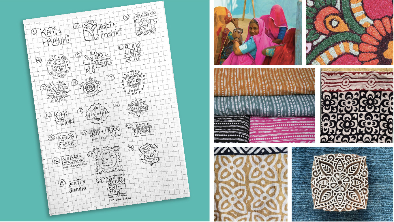
The identity is a blend of modern minimalism and traditional craft. I was inspired by the vibrant colors of Indian festivals and the tactile beauty of hand-carved wood blocks used for textile printing. These ideas came to life through striking geometric patterns, warm color palettes, and a playful and friendly logo.
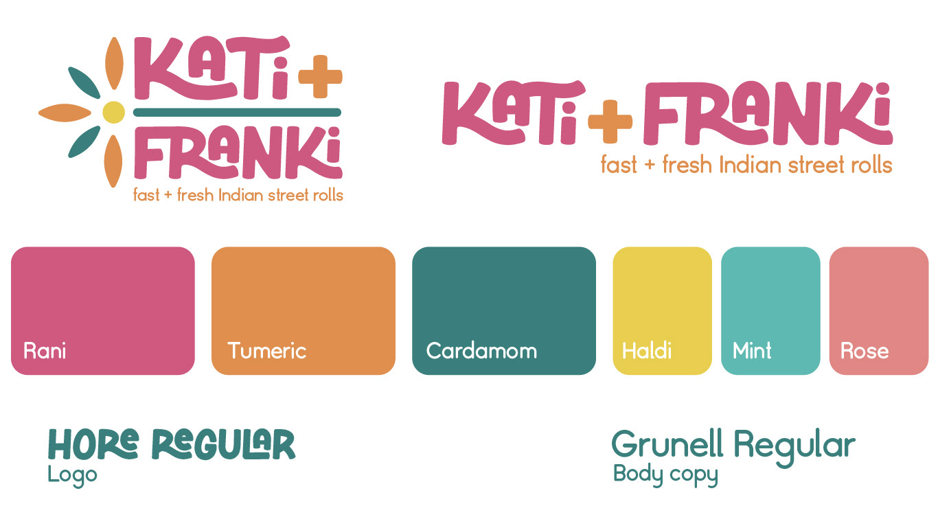
Color plays a key role in the brand story. Inspired by Indian spices like turmeric, cardamom, and mint, the palette brings a sense of freshness, vibrancy, and cultural richness to every touchpoint.
Logo Development
The word-mark was designed to be bold, approachable, and versatile, capturing the energetic spirit of the brand. Rounded corners and playful letterforms reflect a sense of warmth and friendliness, while ensuring strong readability across a variety of formats—from signage and packaging to social media.
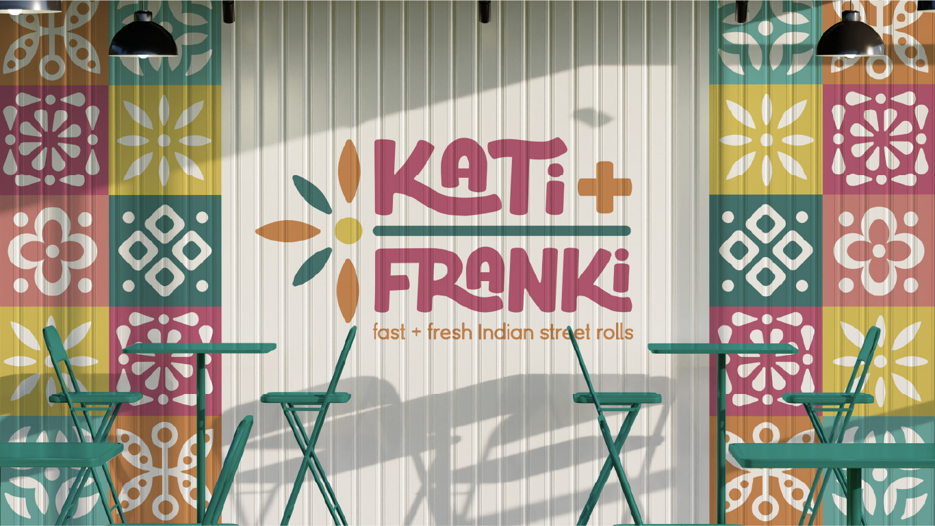
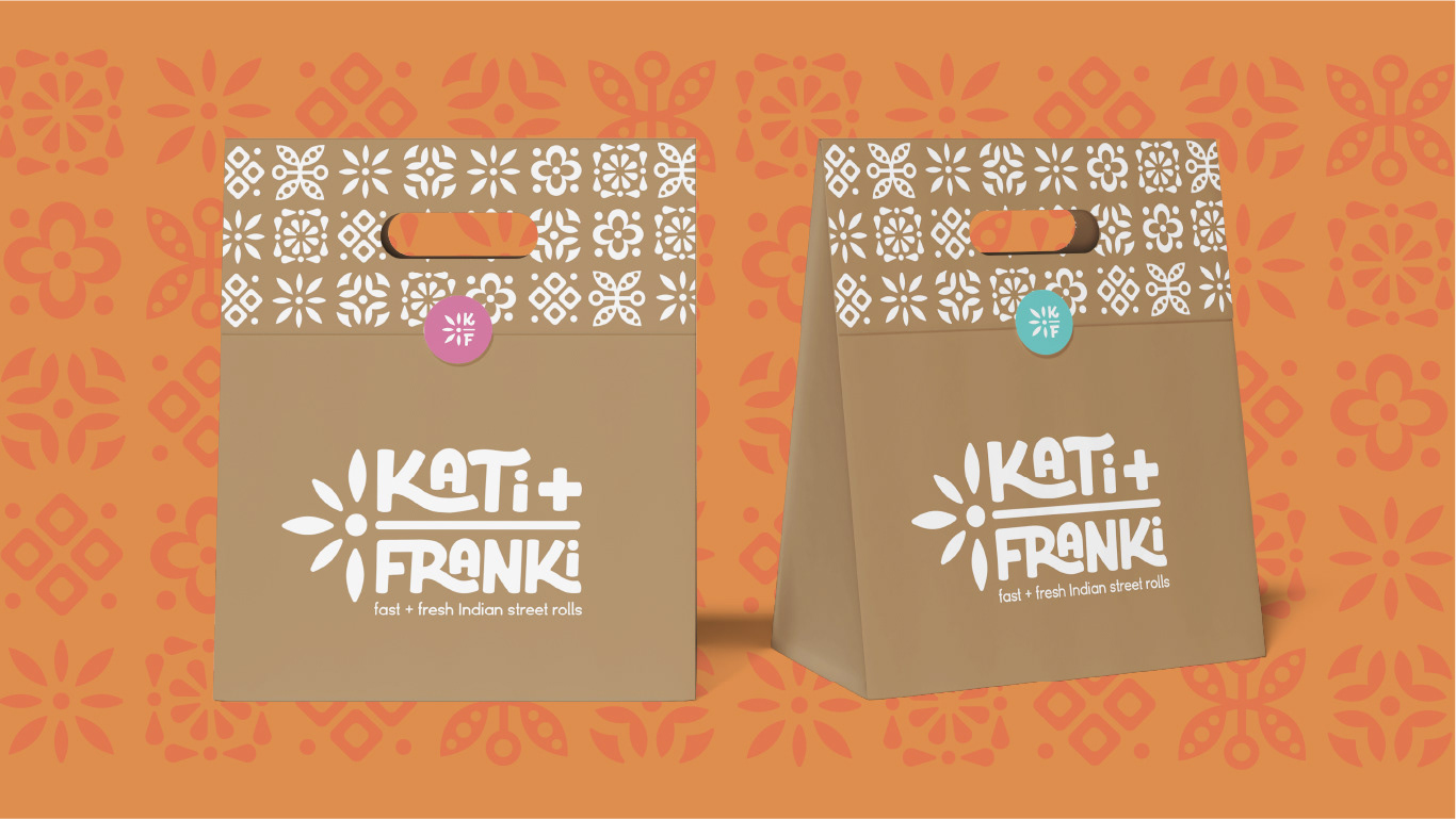
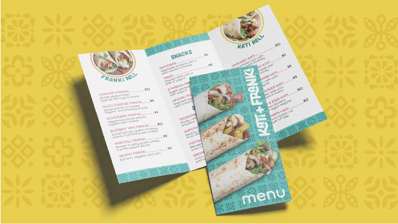
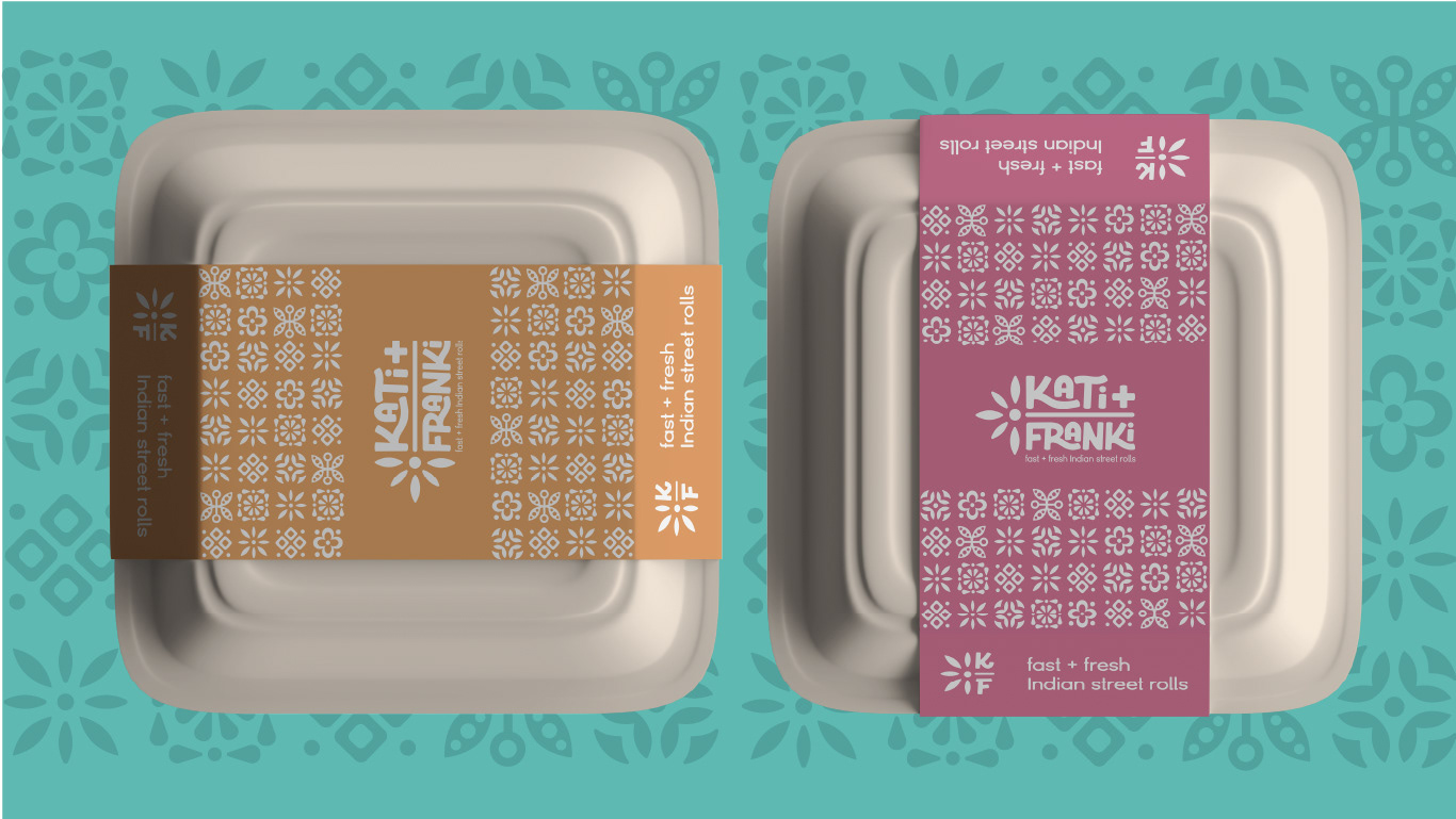
Brand Application
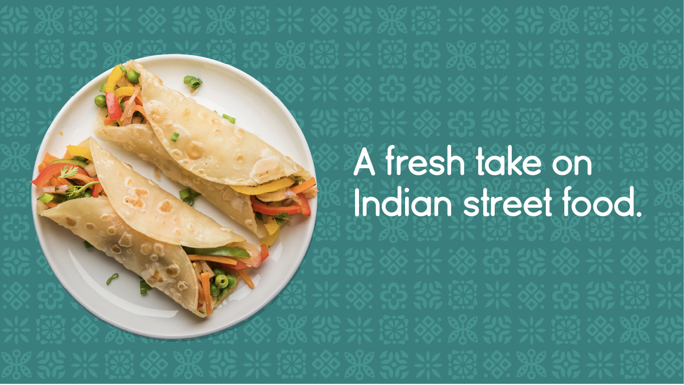
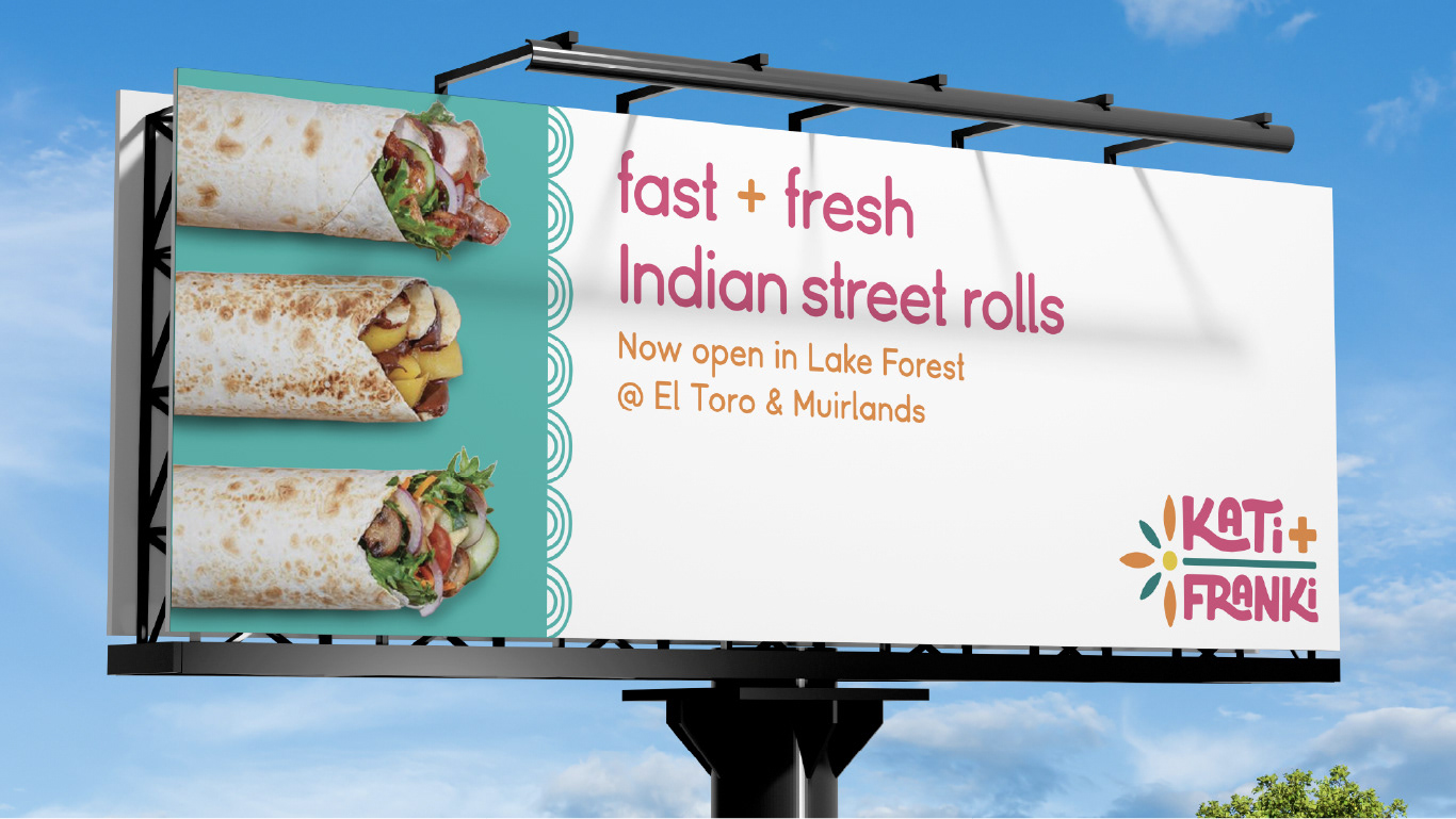
Every touchpoint—from the wrappers to the wall graphics—was thoughtfully designed to reflect the bold, vibrant energy of the Kati + Franki brand. Repeating patterns, warm color blocks, and playful visual elements bring consistency and character to the entire experience. Whether it’s a takeout bag or a dine-in moment, the design helps every interaction feel intentional, fresh, and unmistakably on brand.
Results
Kati + Franki comes to life as a bold and cohesive brand that’s easy to recognize and hard to forget. From the vibrant color palette to the playful geometric elements, every design decision reinforces the brand’s mission: to make fast food feel fresh, flavorful, and rooted in tradition. The final identity strikes a balance between cultural authenticity and modern appeal—inviting customers to enjoy something quick, healthy, and full of personality.

Conclusion
This project was a meaningful opportunity to blend cultural storytelling with contemporary design thinking. I loved exploring how visual identity can connect tradition and innovation, especially through color, pattern, and voice. Kati + Franki is more than just a restaurant brand—it’s a celebration of joyful eating, smart choices, and flavors that feel like home.
Eat well. Live happy.