

Swift Shine: A bright & breezy identity for a cheerful Kiwi cleaning company
Project Overview
Swift Shine is a New Zealand-based cleaning service that brings a cheerful, down-to-earth approach to keeping spaces fresh and spotless. This brand identity project set out to visually express the company’s warm personality and easygoing spirit—qualities rooted deeply in the laid-back, sun-soaked lifestyle New Zealanders are known for.
The goal was to build an identity that instantly felt trustworthy, relaxed, and refreshing—like opening the windows on a summer morning. The result is a modern, friendly visual system that reflects the brand’s promise: professional cleaning with a sunny Kiwi touch.
The Challenge / Brief
The core challenge was to create a visual identity that stood out in a crowded market while staying true to the brand’s values: warmth, reliability, and ease.
Swift Shine didn’t want to look overly corporate or sterile. Instead, they wanted a brand that was professional yet personal—something that would resonate with everyday New Zealanders and feel like a breath of fresh air. The design needed to feel both high-quality and approachable, reflecting the stress-free experience the company delivers.

Concept & Direction
The concept direction was inspired by the New Zealand lifestyle—sunshine, sea breeze, and the friendly rhythm of daily life. These ideas translated into a visual language centered around clarity, warmth, and flow.
I leaned into minimalist shapes and soft geometry to communicate freshness and ease. Sun and water became the foundational elements, evoking lightness, renewal, and movement. The tone of voice remained upbeat and casual, mirroring the brand’s friendly, honest nature.

Logo Development
The Swift Shine logo is a clean typographic mark using a rounded sans serif paired with a geometric sunburst symbol. This combination instantly communicates friendliness and clarity, while the geometry keeps the system feeling modern and crisp.
The sunburst, used both as an icon and accent, became the signature of the brand—symbolizing brightness, positivity, and motion. Alternate marks include a simplified wave icon and a blended sun-water symbol that visually connects the name with the service offering.

Visual Identity Development
The color palette draws directly from nature: Deep Teal for trust and calm, Orange for energy and optimism, Sky Blue for lightness, and Ice Blue for cleanliness and clarity. The palette is bright but grounded—inviting without feeling loud.
Typography plays a key role in the system’s voice. Roca, a soft serif with rounded forms, is used in posters and hero text, giving personality and warmth. Altivo, a clean sans serif, supports body copy and utility layouts with legibility and simplicity.
Graphic elements like curved waves and the sunburst create a flexible system for layouts, social posts, and digital UI—always echoing the brand’s fresh and friendly personality.

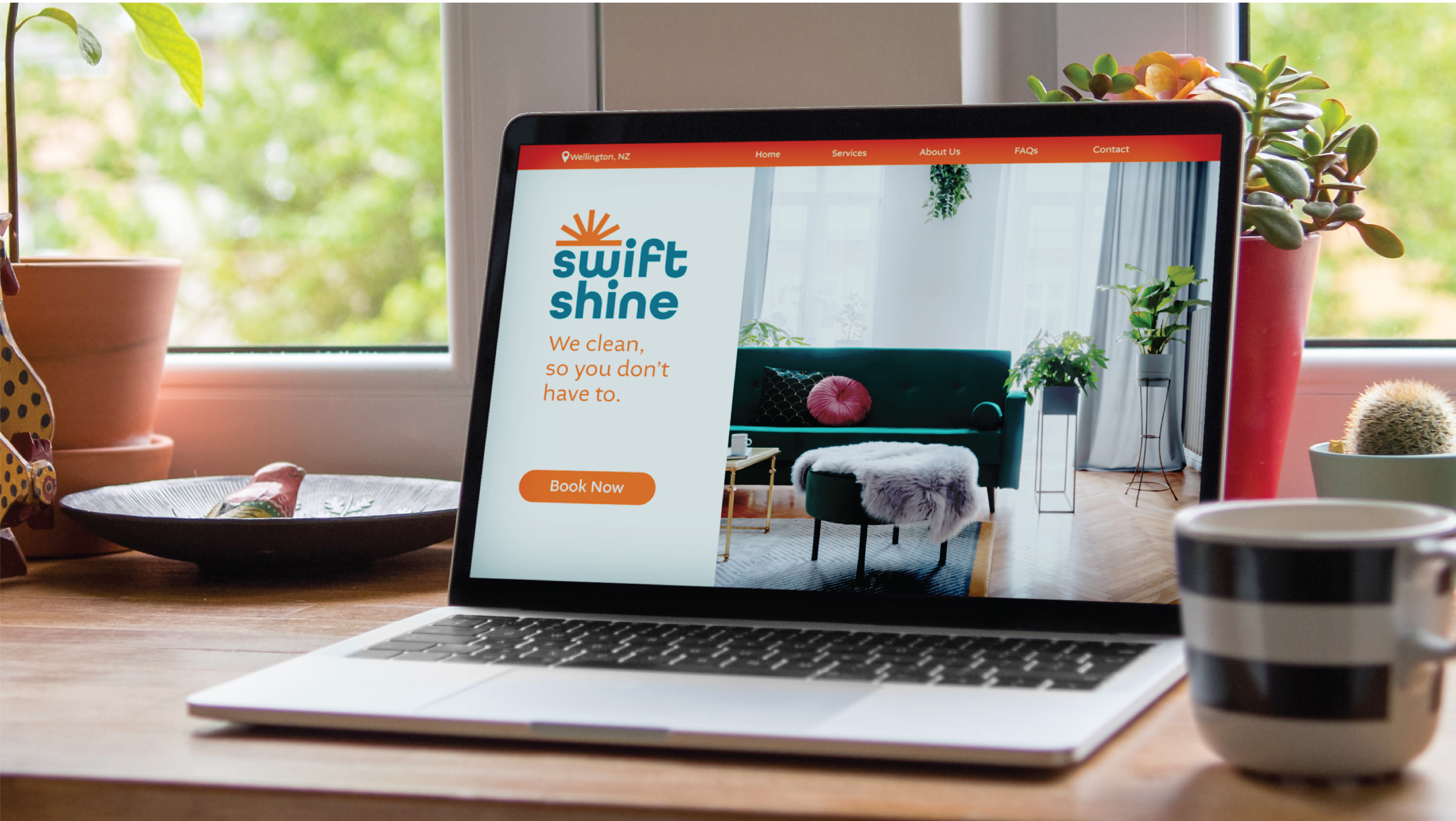
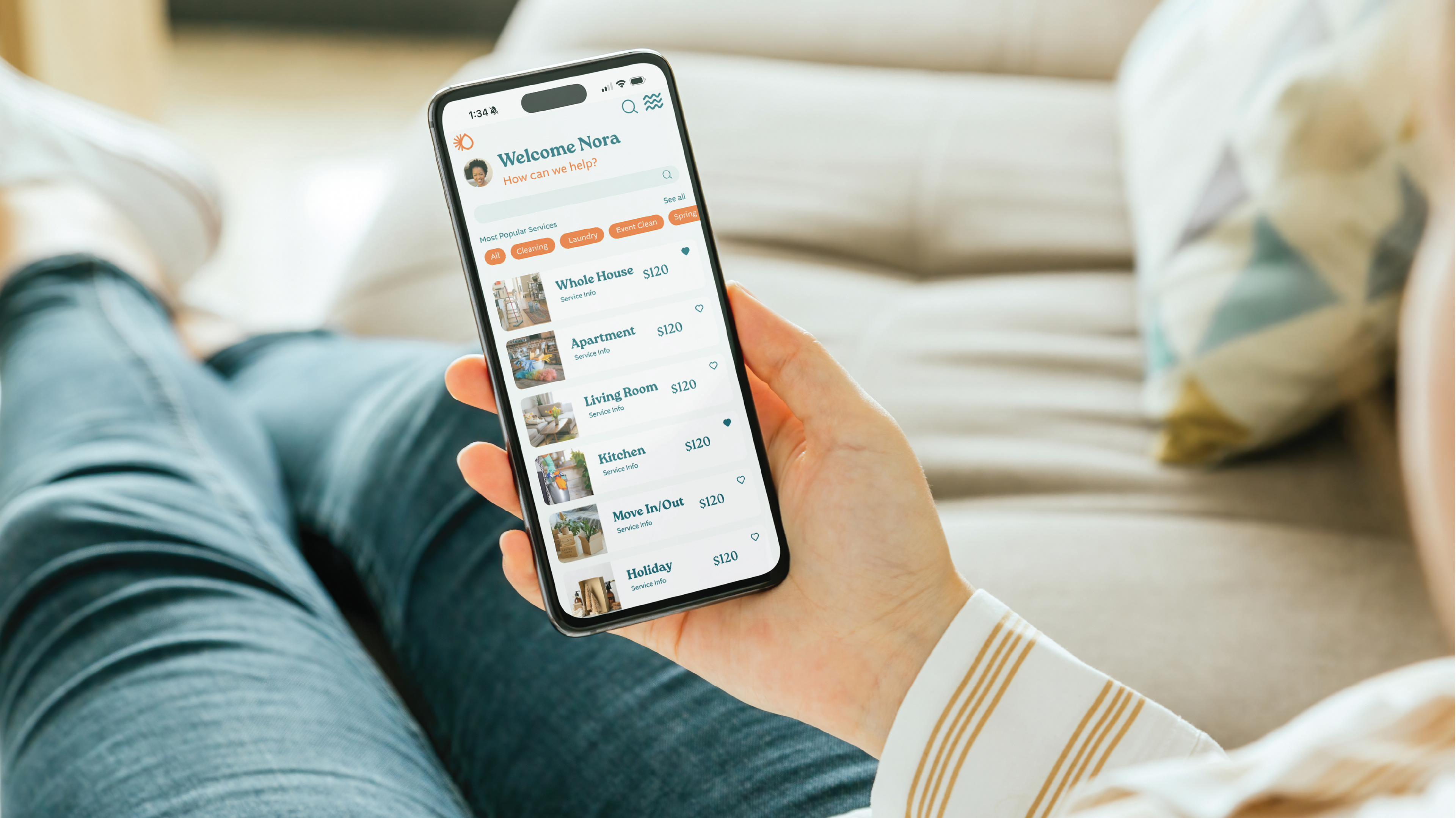
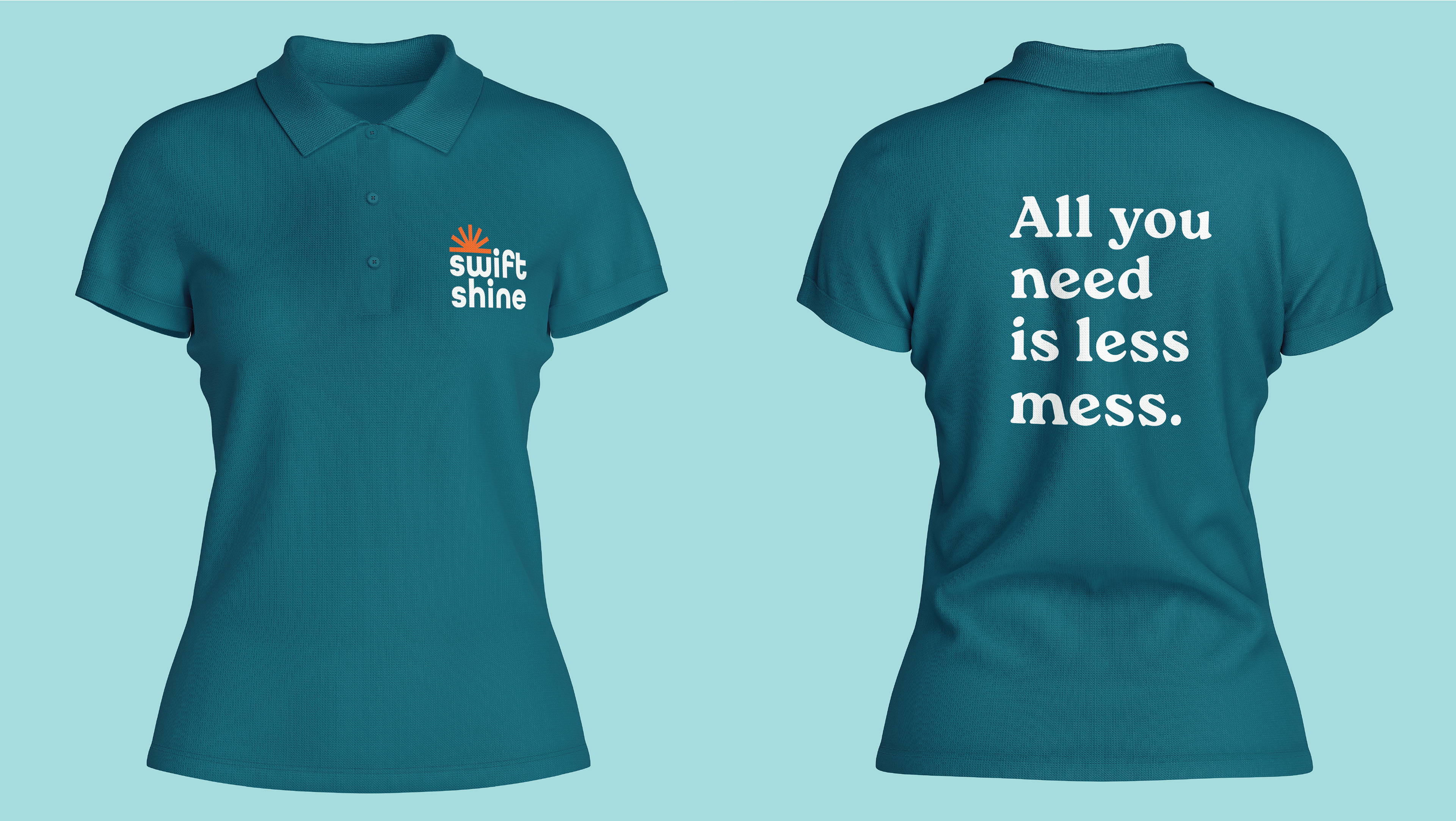
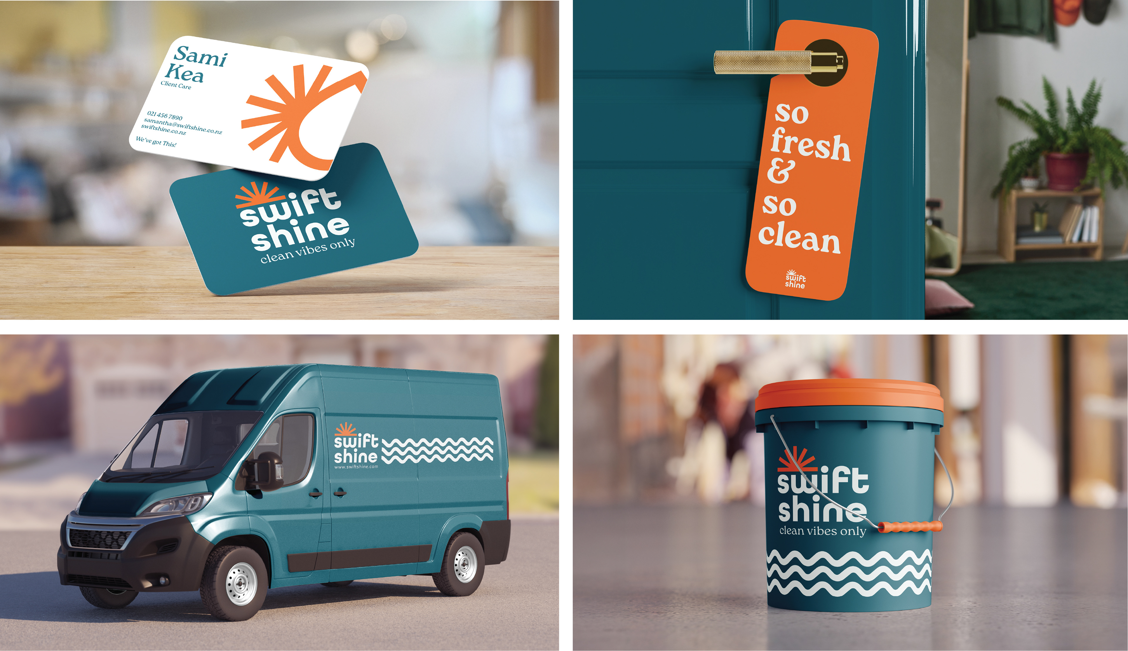
Brand Application
Swift Shine’s identity comes to life across a range of thoughtful applications.
Posters follow a Swiss-style layout with strong grid structure and plenty of breathing room, using bright accents to guide the eye. The website and scheduling app reflect the brand’s easygoing nature with intuitive navigation and soft visual cues.
Social media templates carry the tone of voice—clear, upbeat, and conversational—while visually tying into the identity through bold color pairings and sunburst accents.
On the ground, the brand is visible through staff shirts, van wraps, and business cards, all designed for consistency and recognizability. Door hangers left behind after a job say, “So fresh & so clean”—a little wink to make the experience memorable. Even branded cleaning supplies carry the sunny, professional look through every detail.


Conclusion
Swift Shine’s new identity captures more than just clean spaces—it captures a lifestyle.
By blending clarity with warmth and structure with spirit, the brand now stands out in a saturated market with a confident, cheerful voice. The result is a visual identity that feels as refreshing as the services Swift Shine provides.
Bright, friendly, and unmistakably Kiwi—Swift Shine is ready to make every space sparkle.