
Counter Culture - An Exhibition Identity Born from Rebellion and Resilience
A celebration of rebellion, resilience, and the power of subculture.
This event branding system captures the raw energy of subculture—its power to challenge, disrupt, and transform. Inspired by censored street art and built on bold contrasts, the visual identity speaks to movements that refuse to be silenced.
Project Overview
Counter Culture is an exhibition that explores the influence of subcultures across generations. It highlights their lasting impact, even when faced with censorship or erasure. My role was to create a full event identity and brand system that captured this spirit - bold, unapologetic, and rooted in the raw energy of rebellion.
Concept & Direction
Subculture, even when silenced, still finds a way to shine through.
That became the heartbeat of this identity. I wanted to express how these movements persist—morphing, evolving, resisting—and how they inspire everything from music to fashion to politics.
That became the heartbeat of this identity. I wanted to express how these movements persist—morphing, evolving, resisting—and how they inspire everything from music to fashion to politics.
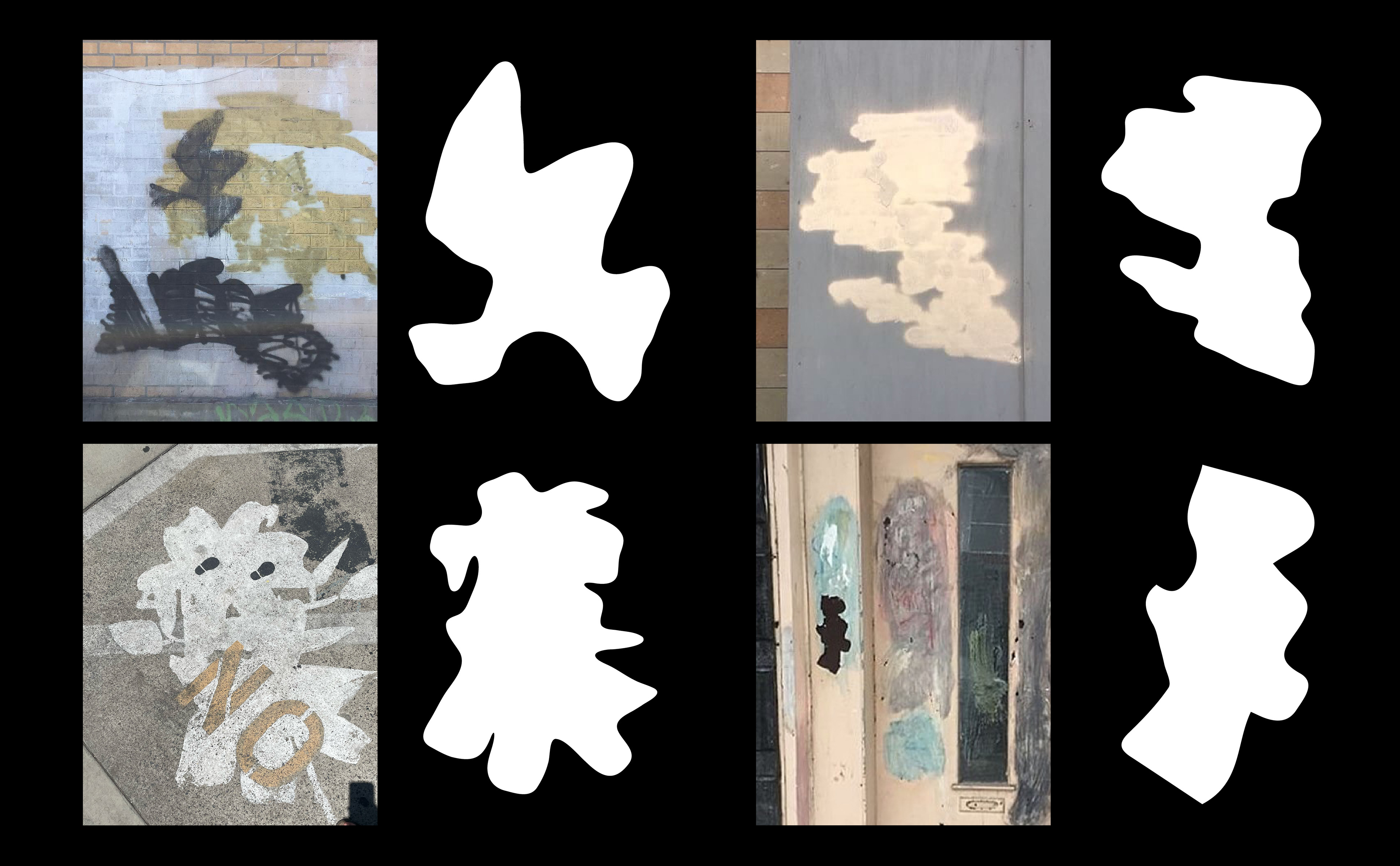
The design concept began with the streets.
I used my own street photography—images of graffiti that had been censored, tagged over, or painted out. These visuals became the foundation for a set of abstract organic shapes, layered and distorted to represent the unpredictability and resilience of underground culture.
I used my own street photography—images of graffiti that had been censored, tagged over, or painted out. These visuals became the foundation for a set of abstract organic shapes, layered and distorted to represent the unpredictability and resilience of underground culture.
Every texture, every shape carries the echo of something suppressed. What was once covered is now the centerpiece.
The Goal
To create a visual experience that doesn't just represent subculture but feels like it.
This system needed to spark curiosity, invite deeper thought, and leave space for the audience to discover, challenge, and reflect. The brand had to hold tension—between chaos and clarity, rebellion and restraint.
This system needed to spark curiosity, invite deeper thought, and leave space for the audience to discover, challenge, and reflect. The brand had to hold tension—between chaos and clarity, rebellion and restraint.

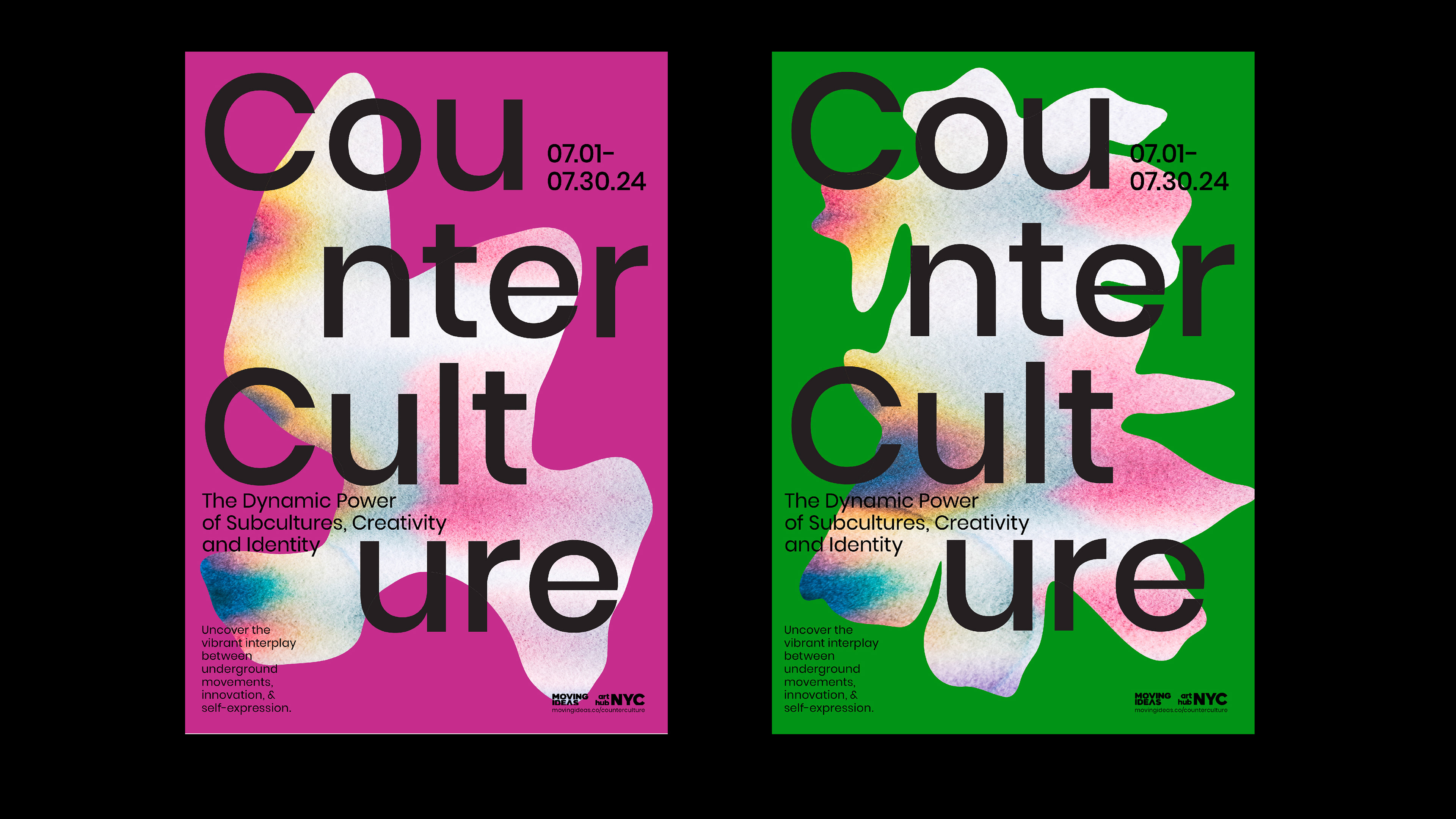
Visual Identity
The identity system is built on bold contrasts and layered meaning.
Clean, sans-serif typography brings clarity and structure, while vibrant backdrops inject energy and immediacy. These are set against graffiti-inspired organic shapes, drawn from real street photography and infused with chromatic textures—echoes of censorship, resistance, and transformation.
Each element works in tension with the others, reflecting the vibrancy, friction, and complexity of subculture movements. The system isn’t just a visual style—it’s a narrative device that tells a story of rebellion through form, color, and texture.
Audience Connection
Designed for those who never sit still.
The visual identity is made for people who are curious, bold, and intentional—those who are driven by causes bigger than themselves. The kind of people who find beauty in disruption and who thrive when the world asks them to rethink everything.
The visual identity is made for people who are curious, bold, and intentional—those who are driven by causes bigger than themselves. The kind of people who find beauty in disruption and who thrive when the world asks them to rethink everything.
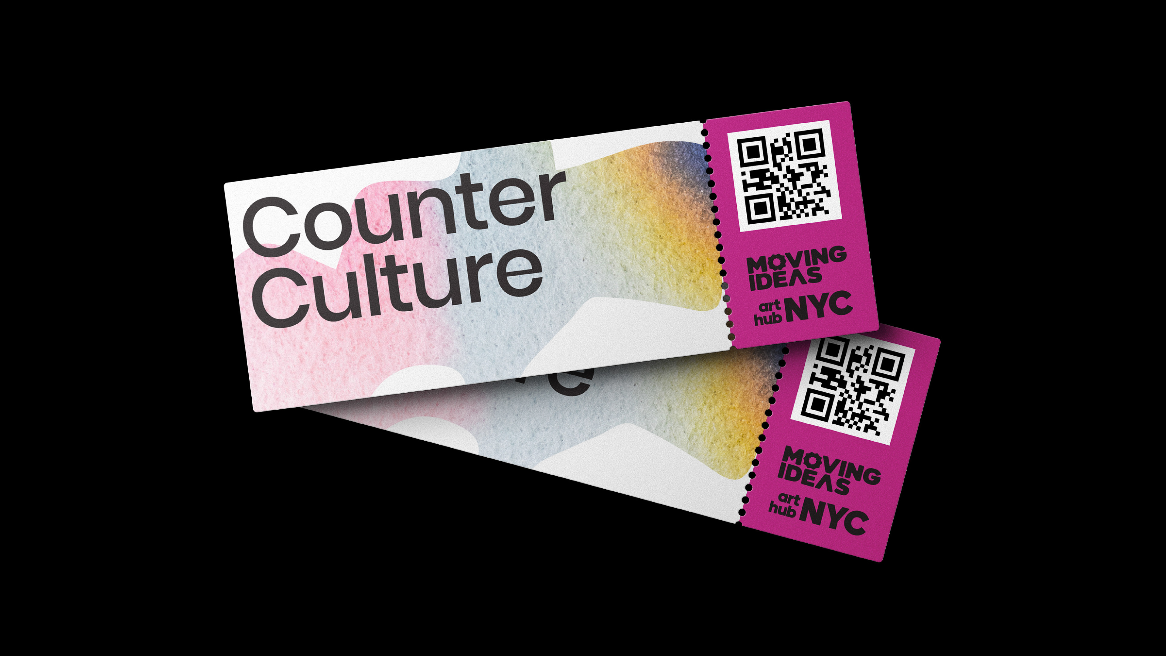
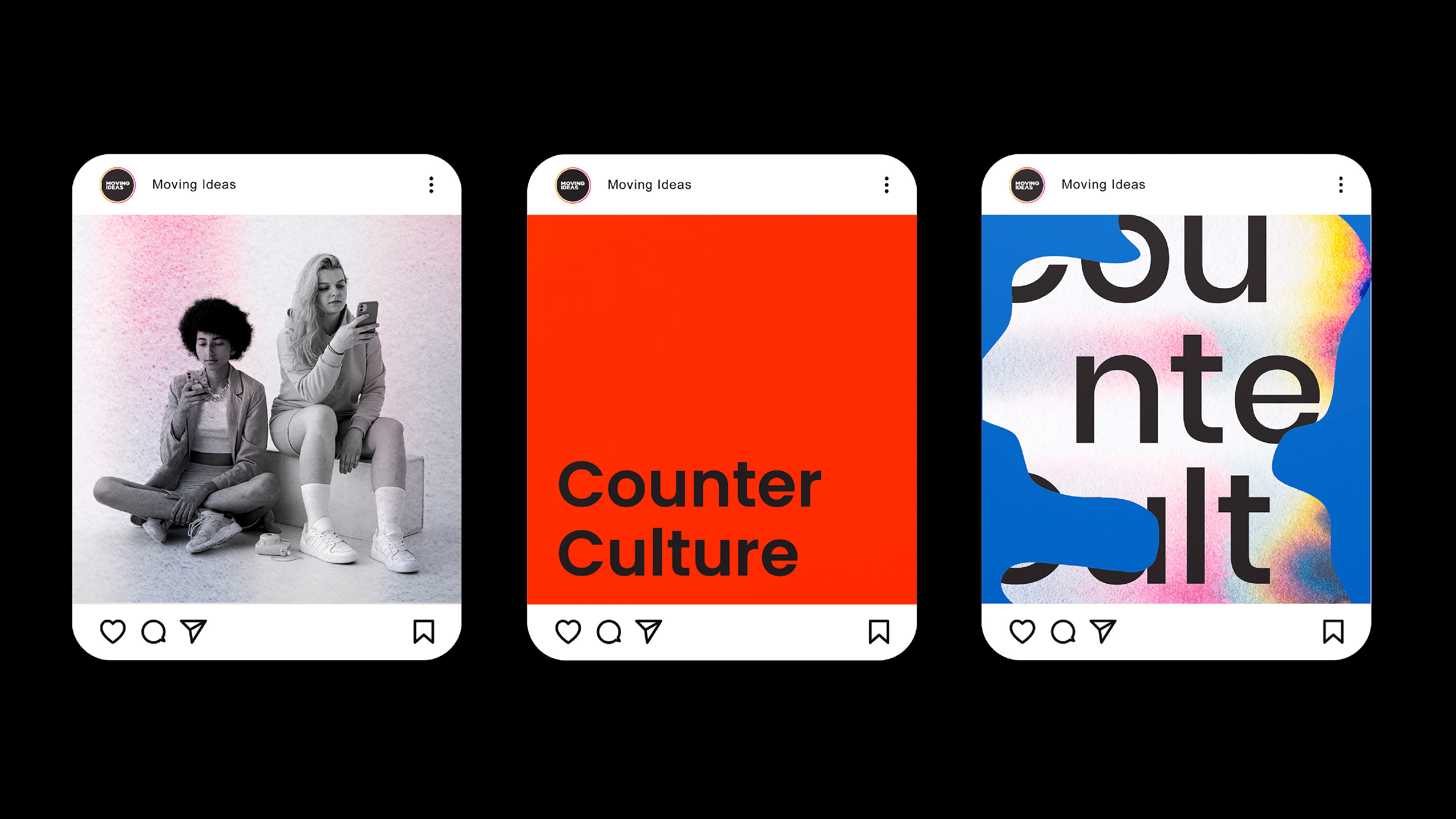
BRAND APPLICATION
A system built to be seen, held, heard—and felt.
The Counter Culture identity comes to life across a wide range of physical and digital touchpoints, each designed to immerse audiences in the spirit of subculture.
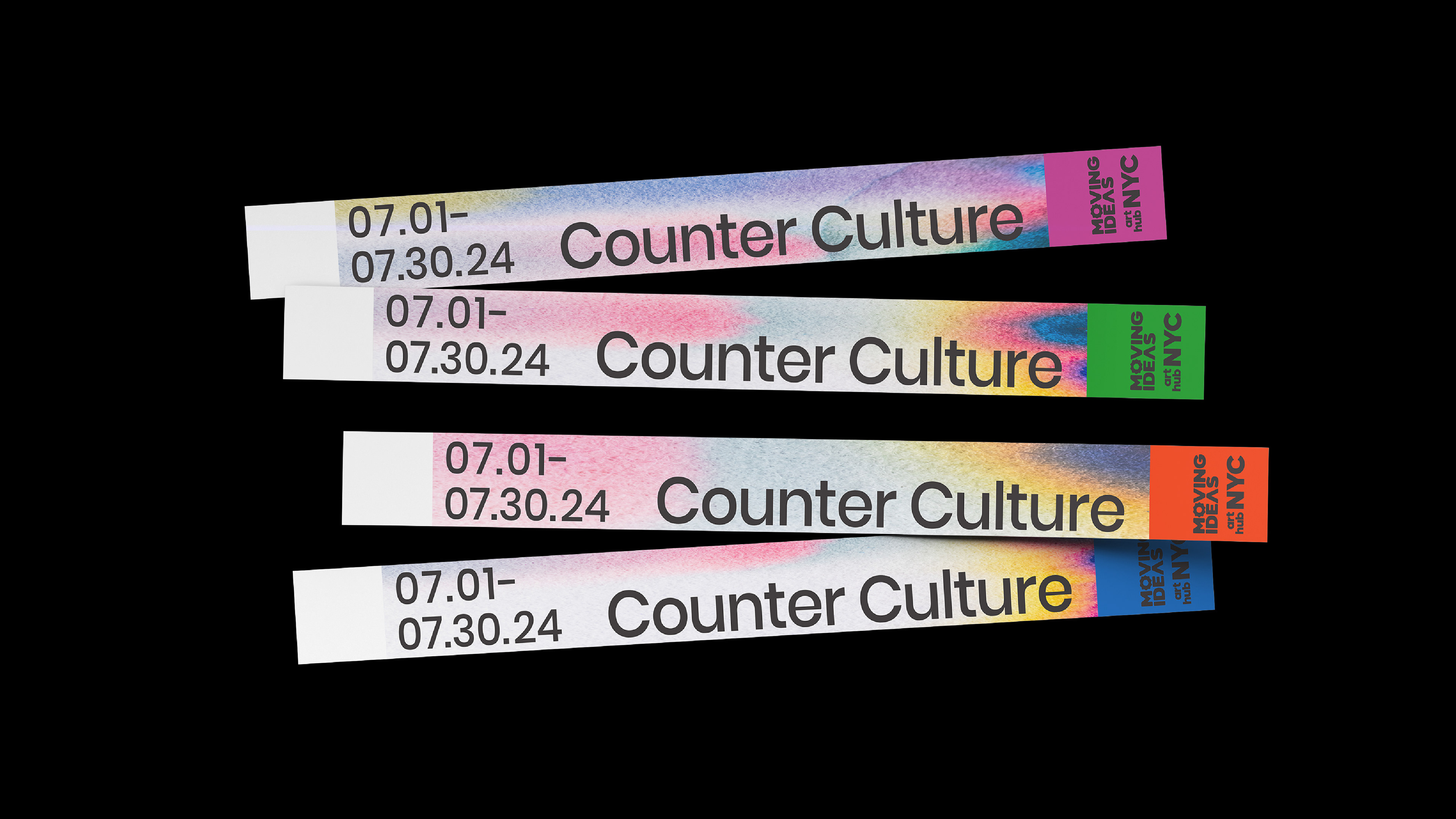
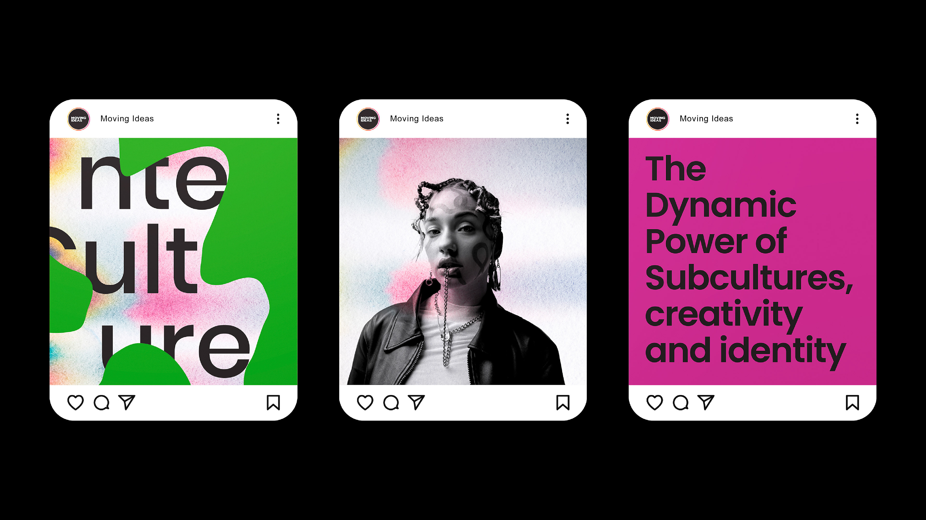
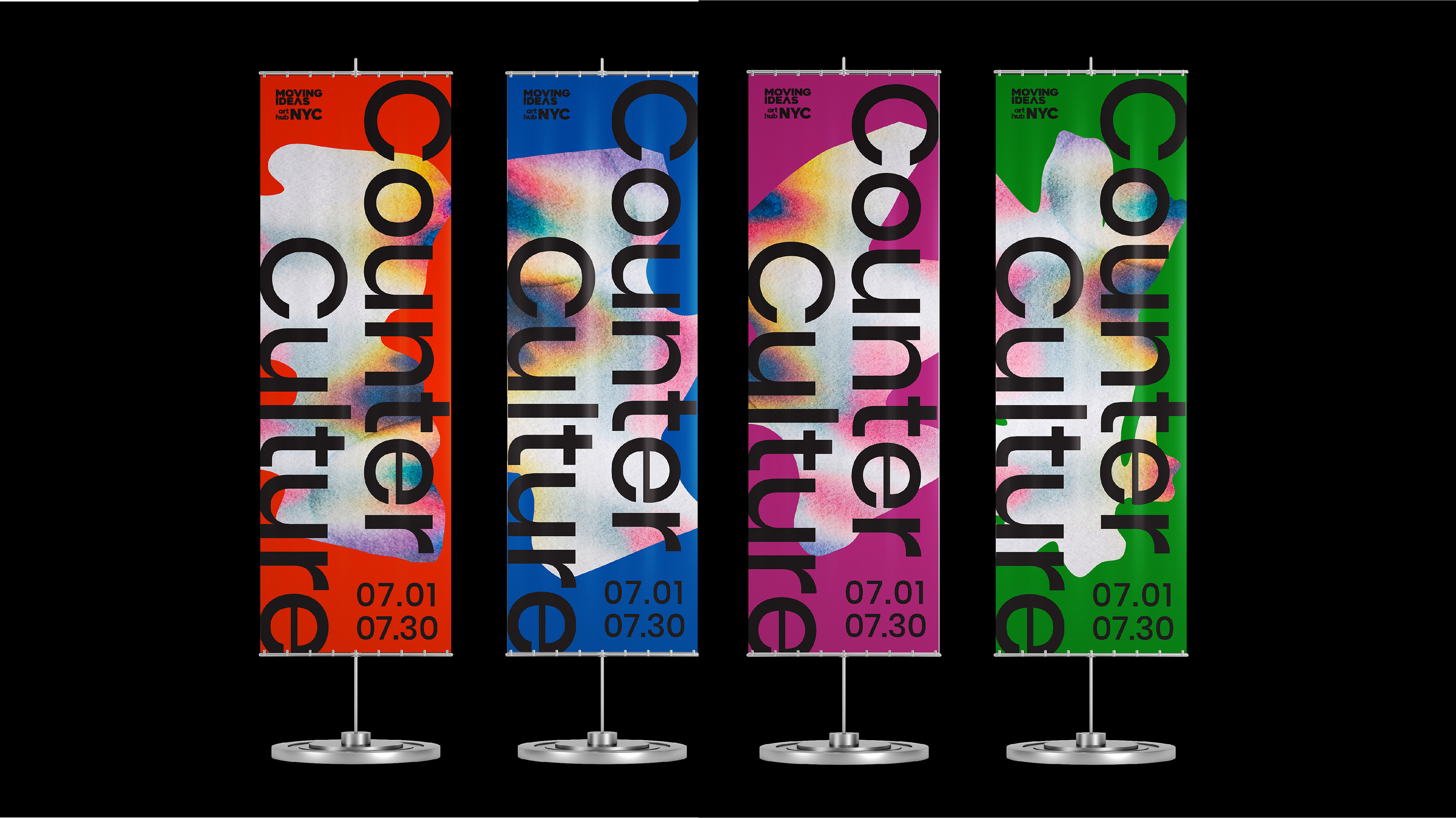
Posters and vertical banner signage command attention in public spaces, while event tickets and wristbands serve as tactile artifacts of the experience. Social media graphics extend the energy online, combining striking shapes and textures with bold, concise messaging.
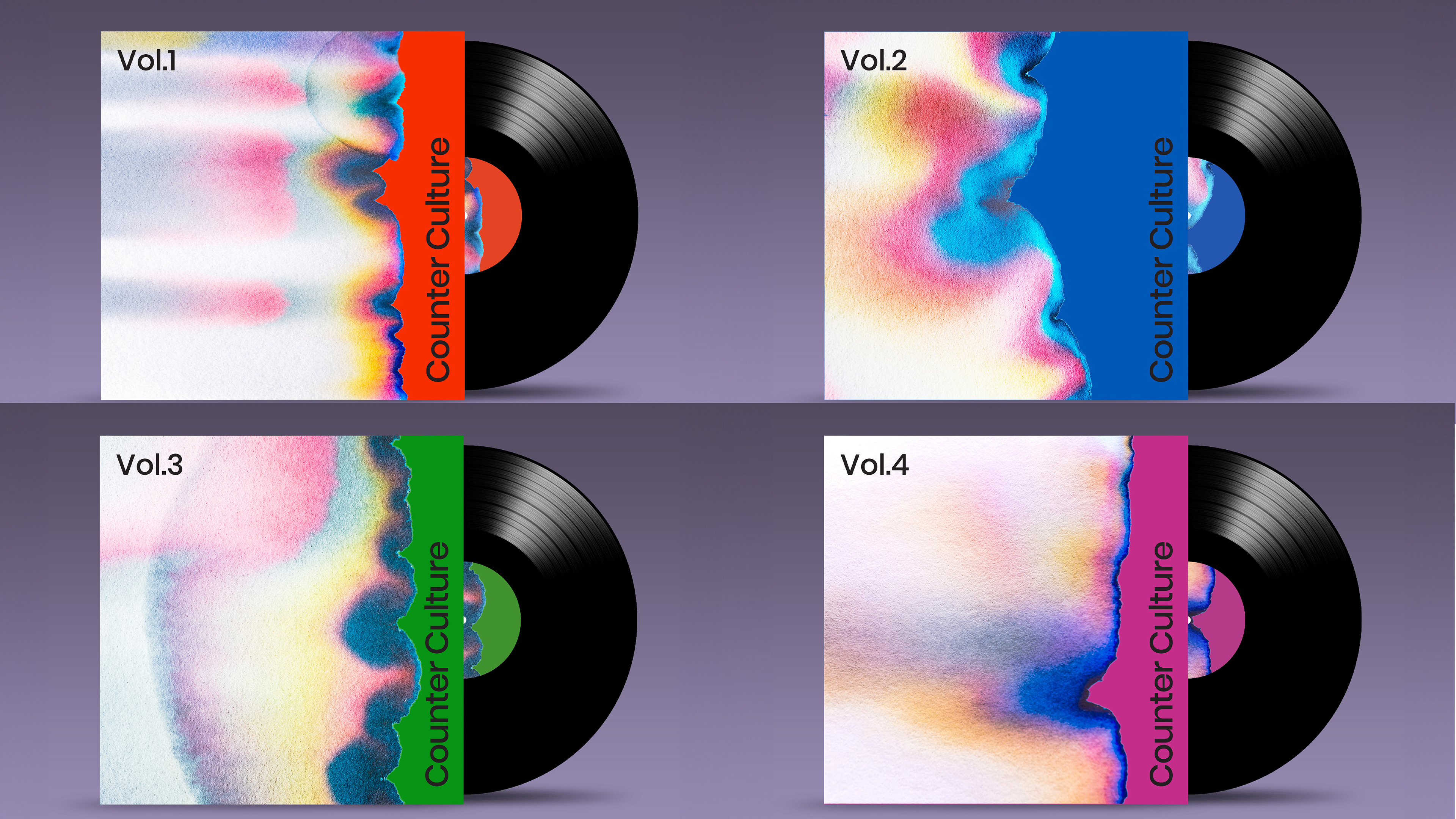
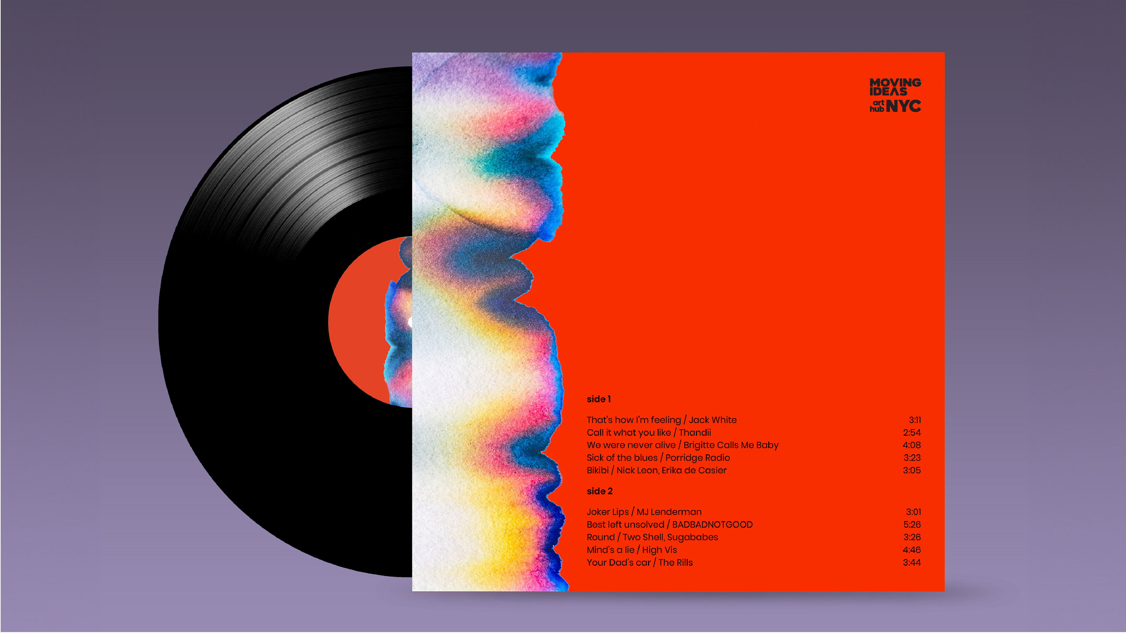
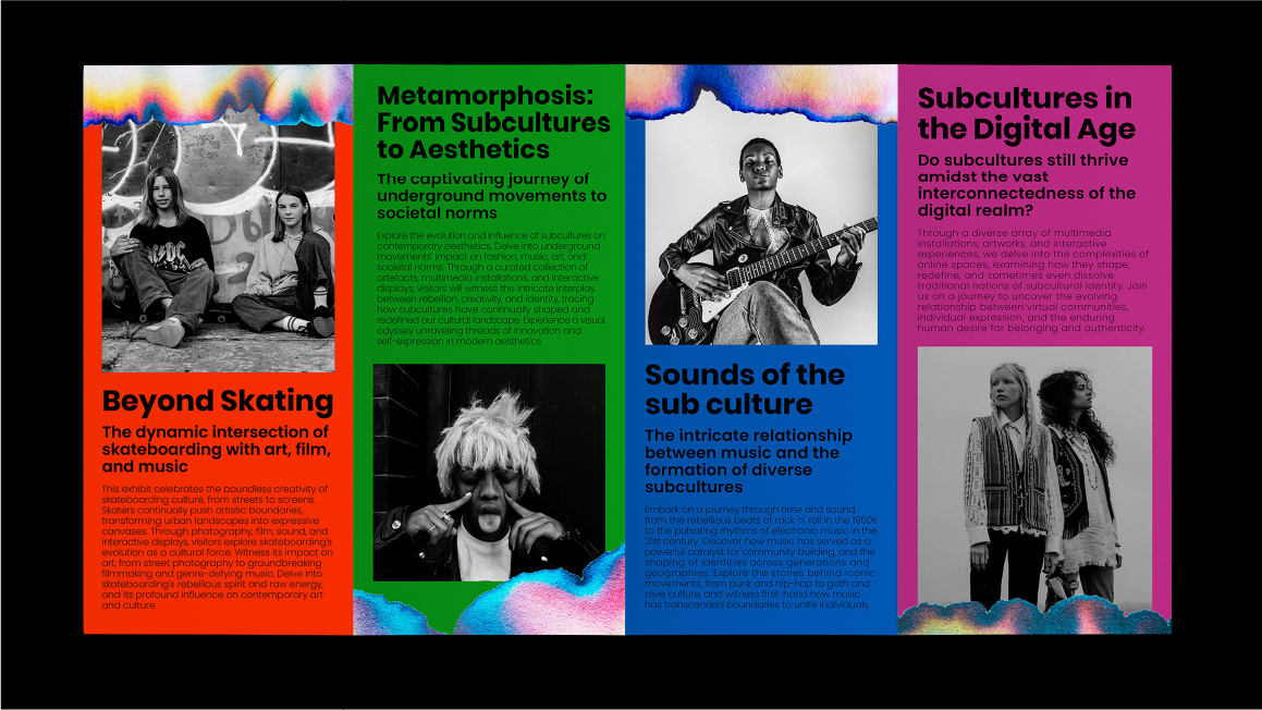
A limited-edition LP record series highlights compilations of subculture music—each sleeve featuring unique compositions from the graffiti-inspired visual language. The accompanying brochure dives deeper into the exhibition’s themes, guiding visitors through the movements and their cultural echoes.
At scale, the identity unfolds through a large-scale wall mural, creating a centerpiece within the event space. Whether printed, projected, or played, every brand application reinforces the message: subculture is not just influence—it’s legacy in motion.


Conclusion
Counter Culture is more than a look—it’s a mindset.
This project pushed me to distill complex social dynamics into a system that is both emotional and structured, expressive yet usable. It’s a visual archive of resistance—and a reminder that when voices are silenced, design can still speak.
This project pushed me to distill complex social dynamics into a system that is both emotional and structured, expressive yet usable. It’s a visual archive of resistance—and a reminder that when voices are silenced, design can still speak.